1 Background
This is a tutorial on how to process your 16S ITS1/ITS2 amplicon sequences and identify the taxonomic identification of the ASVs (i.e., amplicon sequence variants, also known as zOTUs for zero OTUs or ESVs for exact sequence variants) in your sequence data.
To create this tutorial, I have assembled scripts I’ve used to analyze 16S amplicon sequence data provided by Dr. Emma Aronson’s lab. The data I am working with to create this workflow comes from a project that examined soil microbial community composition in Mount Saint Helens. The target region was the V4 region within the 16S gene, and sequencing was performed with an Illumina MiSeq (2x300).
This tutorial would not have been possible without Dr. Benjamin Callahan’s
DADA2 program (Callahan et al. 2016) and tutorials.
Additionally, I would like to especially thank Dr. Mike Lee for his
guidance, his patience, and his Happy Belly Bioinformatics tutorial
called Amplicon
Analysis tutorial (Lee
2019).
You can find all of the scripts used in this workflow in this GitHub repository or you can download it from SourceForge or Zenodo, which is linked in the About Me section.
If you do use this workflow, please cite this using the DOI, which is included in the About Me section
1.1 Considerations before you begin
I was able to analyze these sequences on a High Performance Computing cluster (HPCC) that uses a Slurm scheduler. The minimum amount of total memory I used (not per CPU, but overall) for each step in this workflow (i.e., each step as a separate ‘job’ via Slurm) was 400GB. Having enough memory is essential to running most of these programs, so please keep this in mind before embarking on this workflow!
These steps are also time consuming depending on your memory constraints, so do not be concerned if this process takes a while. If you plan to run through multiple steps in the workflow in one sitting, then I suggest loading tmux before you run your scripts. Here is a handy tmux cheat sheet that I refer to often. For more information on what tmux is and how to utilize it, check this tmux crash course by Josh Clayton.
I also suggest exploring a program called neovim
(aka nvim) that allows you to use Vim (a text editor) to edit R code and
run the code simultaneously. Though nvim is not necessary to run through
this workflow, I find that it makes my life a bit easier when running
through the DADA2 portion of the workflow. I will get more
into the usage of nvim once we get to the DADA2 step(s),
but for more information please view the Neovim Github as well as
its documentation.
You can also find a helpful nvim tutorial here
created by Dr. Thomas Girke from UC Riverside.
Additionally, you will need to change your path to each of these programs depending on where they are stored in your computer or HPCC. If you are running these steps locally (which, if you are, then you have one badass computer!), then you can skip the module loading lines in each step – loading modules is specifically for running these scripts on a HPCC that uses a Slurm Workload Manager.
1.2 Submitting Scripts as Jobs with Slurm
If you are unsure as to how to set up the script for submitting on your HPCC, check the code chunk below. This is the information I use when submitting a job to our Slurm system. Again, this is specifically for a system that uses the Slurm scheduler. For more information on what the arguments mean and how to set up your job submissions, please refer to this handy cheatsheet made by Slurm.
NOTE: If you are running these scripts on an HPCC,
please load the module you need before running, or add
load module name_of_module to your script before you call
on the program you want to use.
#!/bin/bash -l

#SBATCH --nodes=1
#SBATCH --ntasks=1
#SBATCH --cpus-per-task=4 # must match the # of threads if program allows threading (-t #)
##SBATCH --mem-per-cpu=500G # memory per cpu - * if threading, do not let this line run (use ##). Cannot ask for too much memory per cpu!
#SBATCH --mem=500GB # overall memory - if you're threading, keep this line
#SBATCH --time=1-00:00:00     # time requested; this example is 1 day, 0 hrs
#SBATCH --output=name_of_log_file_6.27.21.stdout # name of your log file
#SBATCH --mail-user=email_address@gmail.com # your email address
#SBATCH --mail-type=ALL # will send you email updates when job starts and ends (and if it runs successfully or not)
#SBATCH --job-name="Name of Job 1/1/21" # name of your job for Slurm
#SBATCH -p node_name_here # partition node name
When I don’t know exactly what a program’s output will look like, I will run the program via an interactive job on the HPCC. I also suggest running programs interactively if the program requires multiple lines of code to run, and you want to make sure each step has the correct input (whether it be a file, an object, or the output of a previous step in the code). For some more information on interactive jobs in a Slurm system, check out this blog post by Yunming Zhang. This is how I set up an interactive job on the HPCC (that uses Slurm).
1.3 A bash scripting tip for before we start
I wanted to share a bit of code that you will see being implemented in every script throughout the tutorial. This little bit of code will help you pull out the sample names from your files, allowing you easily run through your files while also keeping track of which samples those files belong to.
Here I am using using a for loop to loop through each fastq files in
a specific directory. In each iteration of the loop, an $f
variable is created, which uses the basename function to
get the file name of the $FILE variable. Then
$SAMPLE is created by using % to remove the
.fastq extension and everything that follows, keeping only
the file name (minus the extension) and calling that
$SAMPLE. Then we can use the $SAMPLE variable
to substitute the file names, which come in handy for running these
scripts over multiple samples at one time. This concept should become
clearer as we move through the workflow. If you’d like more information
on string substitution (i.e., using % to remove parts of a
string), please see this helpful link.
2 Sample pre-processing
2.1 Demultiplex your samples
When preparing sequencing libraries, we typically multiplex our samples. This means that during library preparation, we’ve attached barcodes to our sequences that help us trace the sample that these sequences came from. This allows us to pool multiple libraries together in one sequencing run. After sequencing, the sequences are demultiplexed, meaning the individual sequences are separated out by sample into individual FASTQ files.
Typically your samples will be returned to you already demultiplexed.
However, if your samples are still pooled into one large FASTQ file, do
not panic! You can follow the demultiplexing
tutorial by Dr. Mike Lee which
utilizes the sabre tool. Or,
you can use bcl2fastq2 by Illumina (more information here).
2.2 Sequence Quality and Where to Trim
2.2.1 Check the quality
of your sequences with FastQC
It’s always a good idea to check the quality of your sequences before
you start your analysis, regardless of the type of sequences they are
(metagenomes, RNA-seq data, etc). FastQC (Andrews, n.d.) provides a comprehensive report
on the quality of your sequences and is helpful for the following:
identifying primers or adapters still attached to your sequences;
determining the quality of your reverse reads; etc. You can also use the
FastQC reports to determine if you should attempt to merge your forward
and reverse reads, or just proceed with only the forward reads.
# my 16S and ITS2 sequences are in separate directories, which I why I loop through them separately below
# create a directory to store your FastQC results in
if [[ ! -d ./FastQC_Results ]]; then
mkdir FastQC_Results
fi
# create directory within results directory for 16S FastQC Results
if [[ ! -d ./FastQC_Results/16S_FastQC ]]; then
mkdir FastQC_Results/16S_FastQC
fi
# create directory within results directory for ITS2 (or ITS1) FastQC Results
if [[ ! -d ./FastQC_Results/ITS2_FastQC ]]; then
mkdir FastQC_Results/ITS2_FastQC
fi
# loop through each 16S fastq.gz file and run through FastQC
for FILE in 16S_Seqs/*.fastq.gz;
do
# extract out just the sample name from the file name
f=$(basename $FILE)
SAMPLE=${f%.fastq*} #string manipulation to drop .fastq and everything that comes after
fastqc $FILE --outdir=./FastQC_Results/16S_FastQC
done
# loop through each ITS2 fastq.gz file and run through FastQC
for FILE in ITS2_Seqs/*.fastq.gz;
do
f=$(basename $FILE)
SAMPLE=${f%.fastq*}
fastqc $FILE --outdir=./FastQC_Results/ITS2_FastQC
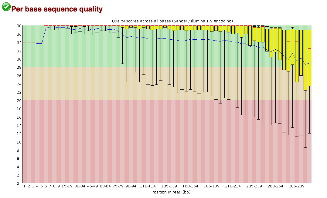
doneFastQC will return a report assessing the per base and per sequence quality of your sequences, as well as the GC and N (i.e., unidentified base) content across your sequences, the distribution of your sequence lengths, and whether or not adapters are still attached to your sequences. The second tab of the report details the per base sequence quality across all of your sequences. The per base quality score (Q score), also known as a Phred score, is the estimated probability that the base call is wrong. The following equation is used for calculating the Q score: \[ Q = -10log_{10}E \] Here, E is the estimated probability of the base call being wrong. The higher the Q score, the smaller the probability of a base call error. A quality score of 30 (Q30) means that the probability of an incorrect base call is 1 in 1000, and that the base call accuracy (1 - probability of incorrect base call) is 99.9%. For more information on quality scores, please see this info from Illumina.
Below is an example of the “per base sequence quality” portion of the report. This portion of the report helps me to determine where I should trim my sequences as I move forward with the analysis. This part of the report can also give you a sense on whether there was an error in your sequencing run. For example, if the average quality score (i.e., the blue line in the report) across all of the bases dips below 30 for half of the sequence length in all of my samples, that could indicate that there was an error with the sequencing run itself.
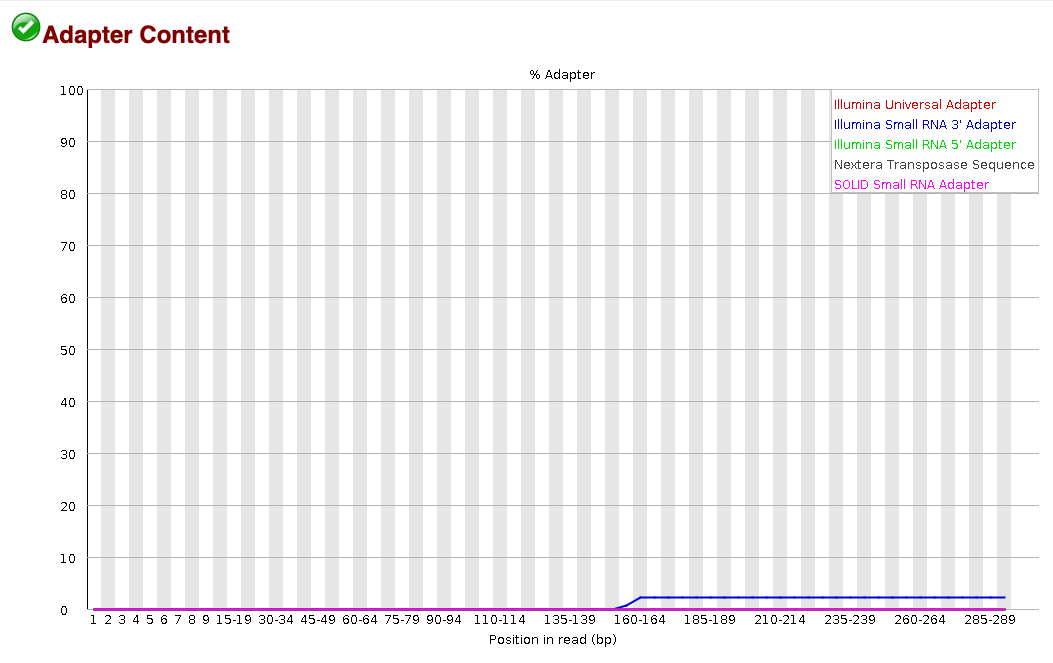
Another useful piece of the FastQC report is the adapter content tab, which is the very last tab in the report. This portion of the report tells us the percentage of reads that have adapter sequences at specific base positions along the reads. The following snapshot from a FastQC report shows that the Small RNA 3’ adapter sequence is found in ~2% of the sequences starting at around the 160th base. We can use this information to then decide exactly which adapter sequences to cut from our samples in the trimming step.
For more on how to interpret FastQC reports, please check out this helpful FastQC tutorial from Michigan State University.
2.2.2 Expected Error
Filtering of Sequences with eestats
The eestats2 program (Edgar and
Flyvbjerg 2015) creates a report detailing the percentage of
reads that will pass through an expected error filter when the reads are
at different lengths. Specifically the program will determine how many
reads at each specific length (i.e., 50 bp, 100 bp, 150 bp, etc.) have
good enough quality to surpass the three expected error thresholds:
0.5%, 1%, and 2%.
Before you run the eestats program, be sure to
gunzip (aka decompress) your fastq.gz files! You can do that by
running the following command:
gunzip /path/to/*.fastq.gz.
# Create directory to store eestats results
if [[ ! -d ./EEstats_Results ]]; then
    mkdir EEstats_Results
fi

# Create specific directory within eestats results for 16S eestats results
if [[ ! -d ./EEstats_Results/16S_EEstats ]]; then
    mkdir EEstats_Results/16S_EEstats
fi

# Create specific directory within eestats results for ITS2 (or ITS1) eestats results
if [[ ! -d ./EEstats_Results/ITS2_EEstats ]]; then
    mkdir EEstats_Results/ITS2_EEstats
fi

# Run eestats2 in loop with 16S fastq files
for FILE in 16S_Seqs/*.fastq;
do
    f=$(basename $FILE)
    SAMPLE=${f%.fastq*}

    usearch -fastq_eestats2 $FILE -output ${SAMPLE}_eestats2.txt
    # move results to EEstats_Results directory
    mv ${SAMPLE}_eestats2.txt EEstats_Results/16S_EEstats
done

# Run eestats2 in loop with ITS2 fastq files
for FILE in ITS2_Seqs/*.fastq;
do
    f=$(basename $FILE)
    SAMPLE=${f%.fastq*}

    usearch -fastq_eestats2 $FILE -output ${SAMPLE}_eestats2.txt
    # move results to EEstats_Results directory
    mv ${SAMPLE}_eestats2.txt EEstats_Results/ITS2_EEstats

done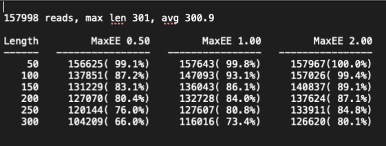
For more information on the eestats2 programs by
USEARCH, please read the
documentation here.
2.3 Decontaminate & Trim sequences and cut adapters, primers, etc
There are plenty of programs out there that can be used for trimming,
and the following three are the most popular for amplicon analyses: cutadapt,
trimmomatic,
and bbduk
(Bushnell, n.d.). All of these programs
are reputable, but I personally like the bbduk, and will
use this tool for trimming and adapter removal.
Before I trim my sequences, I refer to the FastQC reports to find out exactly which adapters I should remove from my sequences. For example, when looking at the adapter content portion of the FastQC report above, I can see that the Nextera Transposase Sequence is still present in that particular sample. Thankfully Illumina shares their adapter sequences on their website, allowing us to easily find common adapters in sequences, like the Nextera Transposase Sequence for example.
I also know that with the sequences I am analyzing, the PCR primers
are still attached (FastQC may identify these primers in your report’s
Overrepresented Sequences tab, but not necessarily the origin of these
sequences). I can either remove these primer sequences using the actual
sequence using the (literal=) flag, or I can trim from the
right (ftr=) and/or the left (ftl=) of the
sequences if I know exactly how long the primer sequences were.
It is recommended to check the overrepresented sequences from the
FastQC report to see if there are contaminating sequences present in
your data. I suggest taking the most frequent overrepresented sequence
and running it through BLASTn
if the source of this overrepresented sequence says “No Hit” (meaning
that FastQC cannot attribute this sequence to its list of adapter
sequences). If the sequence comes up as a contaminant (i.e., a different
gene than the amplicon you’re looking at) or adapter/primer of some
kind, you can add this to the literal= flag in
bbduk to remove the contaminant.
In addition to removing adapter and primer sequences using the the
literal= flag, I also include a reference file provided by
bbduk (referenced in the ref= flag) that
contains all of the Illumina TruSeq adapters. The sequences in the
reference file, in addition to the given adapters and primers, will be
removed from the sequences. Additionally, bbduk decontaminates sequences
by matching kmers (aka reads of a specific length k) to reference
genomes. If the kmers match the reference genome, then the kmer is kept.
The longer the kmer, the higher the specificity - but there is a limit
to this, seeing as the likelihood that long kmers are shared across
multiple reads is unlikely. If your kmer length is too short, you could
be keeping sequences that are adapters, primers, etc by accident (this
is why using the literal sequence flag and the adapter reference file is
helpful in bbduk).
Below the shell script is a description of all of the flags used by
bbduk and exactly what they mean. For more information on
the bbduk flags, please see the bbduk documentation.
path=/path/to/sequences/here # replace with the path to your files
# my sequence files are in $path/16S_Seqs/ -- see for loop below

if [[ ! -d ./Trimmed_Seqs ]]; then # creating directory to store trimmed sequences in
    mkdir Trimmed_Seqs
fi

if [[ ! -d ./Trimmed_Seqs/16S_Trimmed ]]; then # creating directory for specifically trimmed 16S sequences
    mkdir Trimmed_Seqs/16S_Trimmed
fi

for i in ${path}/16S_Seqs/*_R1.fastq;
do
    f=$(basename $i)
    SAMPLE=${f%_R*}

    bbduk.sh -Xmx10g in1=${path}/16S_Seqs/${SAMPLE}_R1.fastq in2=${path}/16S_Seqs/${SAMPLE}_R2.fastq out1=${path}/Trimmed_Seqs/16S_Trimmed/${SAMPLE}_R1_clean.fastq out2=${path}/Trimmed_Seqs/16S_Trimmed/${SAMPLE}_R2_clean.fastq literal=TCGTCGGCAGCGTCAGATGTGTATAAGAGACAG,GTCTCGTGGGCTCGGAGATGTGTATAAGAGACAG ref=/bigdata/aronsonlab/shared/bbmap_resources/adapters.fa rcomp=t ktrim=r k=23 maq=10 minlength=200 mink=13 hdist=1 tpe tbo

done

# ref ---> file provided by bbduk that holds collection of Illumina TruSeq adapters
# literal=(sequence here) ---> literal adapter sequences to remove; "N" represents any base -- in this case, they are indexes within the adapters
# rcomp=t ---> Rcomp looks for kmers and their reverse-complements, rather than just forward kmer, if set to true
# ktrim=r ---> “ktrim=r” is for right-trimming (3′ adapters)
# k=23 ---> look for kmer that is 23 bp long
# mink=11 ---> in addition to kmers of x length, look for shorter kmers with lengths 23 to 11 (in this case)
# maq=10 ---> This will discard reads with average quality below 10
# hdist=1 ---> hamming distance of 1
# mlf=50 ---> (minlengthfraction=50) would discard reads under 50% of their original length after trimming
# trimq=10 ---> quality-trim to Q10 using the Phred algorithm, which is more accurate than naive trimming.
# qtrim=r ---> means it will quality trim the right side only
# tpe ---> which specifies to trim both reads to the same length
# tbo ---> which specifies to also trim adapters based on pair overlap detection using BBMerge (which does not require known adapter sequences)
# mm ----> Maskmiddle ignores the middle base of a kmer, can turn off with mm=f
To be extra cautious and ensure that the trimming step was
successful, I will run the trimmed sequences through FastQC and compare
the reports. If the per base and per sequence qualities have improved
and/or the adapters are absent, then I will move forward with the
workflow. However, if I am still not happy with the quality of the
trimmed reads, I will then run the trimmed reads through
bbduk in hopes of removing persistent, unwanted sequences.
I will also check the overrepresented sequences and their frequencies
again, and run the most frequent overepresented sequence(s) in
BLASTn.
3 ASV Assignment with
DADA2
All of the steps in this portion of the workflow (excluding the tmux
and nvim code chunks) have been adapted from Dr. Callahan’s
DADA2 tutorial and
Dr. Lee’s amplicon tutorial.
To prepare for running DADA2, I want to separate our
sequence files by locus and region. For example, you do not want to
analyze your 16S and ITS2 sequences together in DADA2 – combining loci
and even different regions of the same loci can interfere with the
DADA2 algorithm. For example, even if you have 16S
sequences of just the V3 region, and a set of 16S sequences with the
V3-V4 region, you would want to run these regions separately through the
DADA2 pipeline. The reason for this will become clearer as
we get to the filtering and trimming step and the error rate prediction
step.
To create separate directories for your sequence data, I first ensure
that their file names include their amplicon that’s been sequenced for
that particular sample (e.g., the 16S V4 data for Sample1 is in the file
Sample1_16S.V4_R1_001.fastq). Then I would run the
following line of code.
# make sure you are in the correct directory before doing this
mv *_16S.V4_* 16S.V4_Seqs
# format of move command: mv file_name directory_name
Here I am using a * which is a special character that
can be used to represent any character or set of characters. In this
case, I am telling the mv command to move any files that
have the _16S.V4_ pattern anywhere in the file name to a
directory called 16S.V4_Seqs. After running this command, I
make sure that my script containing the following DADA2 R
code is in the directory with the specific files you want to analyze. My
DADA2 R script is called
DADA2_tutorial_16S_pipeline.R, which you will see me
reference in a couple of code chunks.
3.1 Run Interactive Job +
tmux on HPCC
Personally, I like to run through DADA2 via an
interactive job on our HPCC. This will allow us to run scripts line by
line and check the output, rather than submitting a job to run in the
cluster without our supervision. Basically, this is an easy to way
constantly check our progress and (ideally) catch errors as soon as they
happen. Again, your HPCC must use Slurm to run an interactive job in
this manner.
srun --partition=node_name_here --mem=400gb --cpus-per-task 4 --ntasks 1 --time 08:00:00 --pty bash -l
# --cpus-per-task and --ntasks are not necessary
# --cpus-per-task is needed for multithreading
Once the interactive job is running, we can use tmux
and nvim to start running through the
DADA2 R script.
tmux new -s mysession # start new tmux session named mysession; do this if you have not started running tmux already
nvim DADA2_tutorial_16S_pipeline.R # load R script using nvim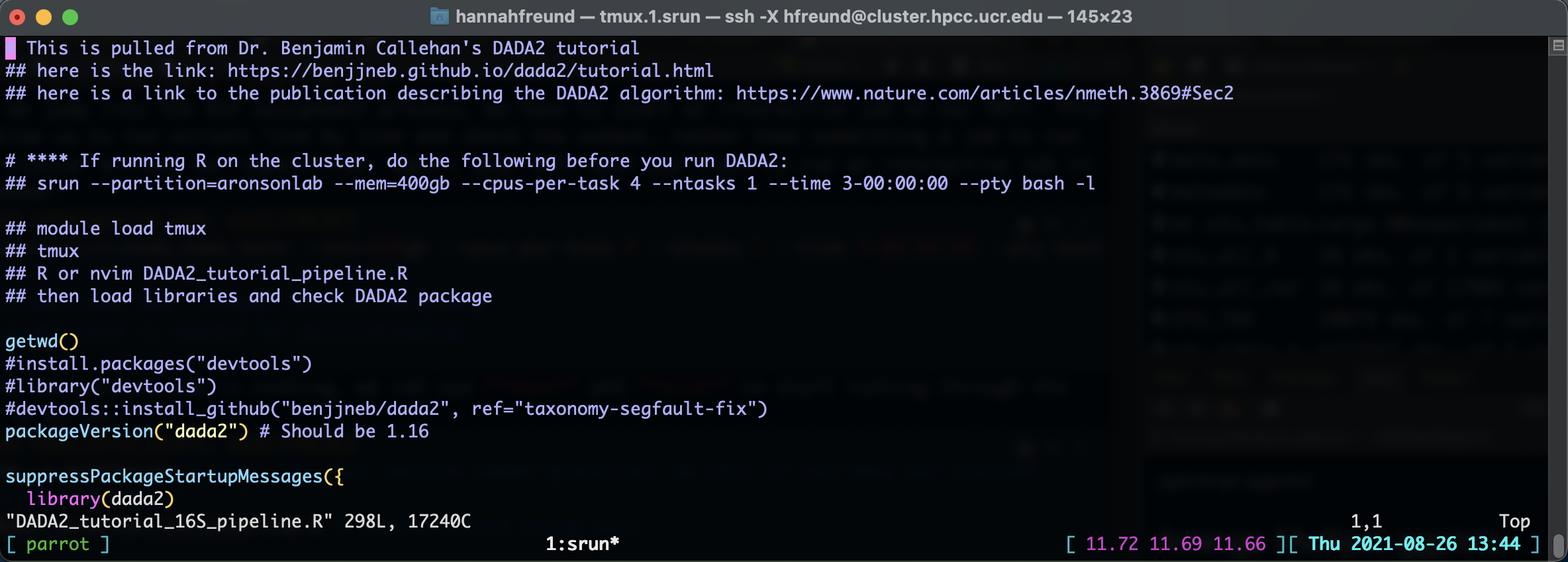
\rf. This will open another window showing your terminal.
You can toggle the horizontal verses vertical alignment fo the windows
by typing Ctrl-w shift-H for a horizontal alignment or
Ctrl-w shift-Vfor a vertical alignment. Below is what the
screen should look like after typing \rf followed by
Ctrl-w shift-H. You can see the R script is open in the
left window, and my terminal is open in the right window.
\rf
Now that we are in nvim, all you need to do to run a line of
code is to just hit the space bar! You can also toggle
between windows using Ctrl-w w, edit or type code by
pressing i to insert code, and leaving the editing mode by
pressing esc. To quit and save changes to your R file, just
type :wq, or to quit without saving changes to your file,
just type :q!. When using nvim, I keep Dr. Girke’s handy tmux/nvim
tutorial open as a reference just in case.
3.1.1 Load the path & FASTQ files
We can start by loading the libraries we need as well as the path to the sequences you want to analyze. In this example I will be analyzing 16S V3-V4 sequences, so I set the path object to be the path to those specific sequences.
getwd() # double check that we are in the correct directory, where are trimmed sequences are stored.

packageVersion("dada2") # see which version of DADA2 you have installed

suppressPackageStartupMessages({ # load packages quietly
  library(dada2)
  library(tidyr)
  library(ggpubr)
  library(decontam)
})

path <- "/path/to/fastq/files" # CHANGE ME to the directory containing the fastq files after
list.files(path)

## Read in sample names
fnFs <- sort(list.files(path, pattern="_R1_clean.fastq", full.names = TRUE))
fnFs # sanity check to see what the file names are

fnRs <- sort(list.files(path, pattern="_R2_clean.fastq", full.names = TRUE)); save.image(file = "mydada_16S.V4.Rdata") # saves all objects in global env.; runs after portion of code before ";"

# Extract sample names, assuming filenames have format: SAMPLENAME_XXX.fastq
sample.names <- sapply(strsplit(basename(fnFs), "_R1"), `[`, 1) #pattern where you want to split the name; i.e., at the _R1 level
## want to split by R1 so that you do not get duplicate sample names for each R1/R2 paired-end sequences
save.image(file = "mydada_16S.V4.Rdata") # save global env.

sample.names # sanity check
If you have already started the DADA2 workflow and want
to pick up from where you left off, then you can run this next code
chunk to load everything that was in your global environment and saved
to an .Rdata object (I will explain this code when we save our first
.Rdata file).
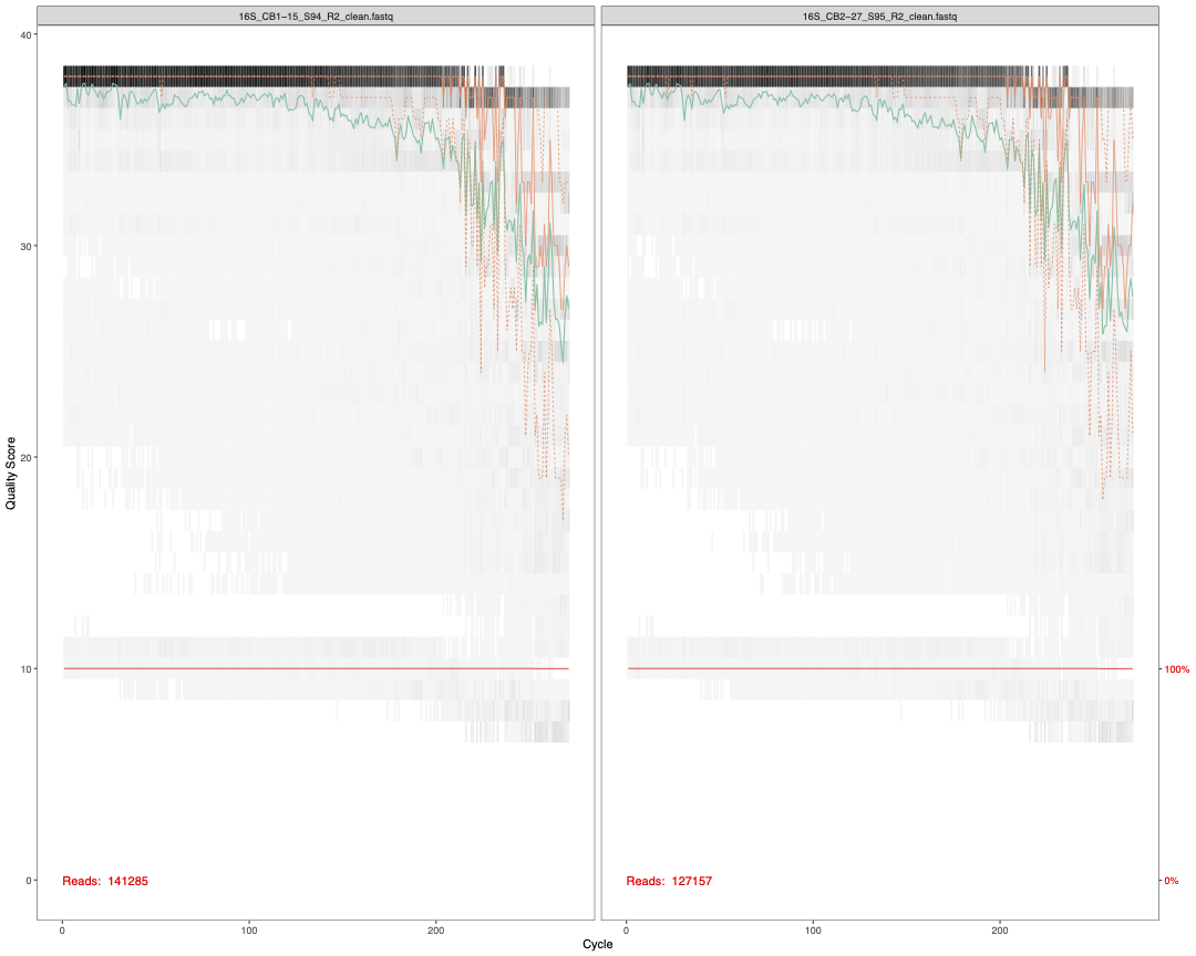
3.2 Check sequence quality
Though we have already done this with FastQC, there is a
step here to check the quality of our forward and reverse reads. These
per base sequence quality reports do look nicer than the
FastQC output and tell you the total number of reads in
that particular sample. We use ggsave() from the
ggpubr package (Kassambara 2020) to save these reports as high
quality PDFs.
plot1<-plotQualityProfile(fnFs[1:2]) # check quality of Forward reads (2 samples)
plot2<-plotQualityProfile(fnRs[1:2]) # check quality of Reverse reads (2 samples)

ggsave(plot1,filename = "16S_pretrim_DADA2_F_quality.pdf", width=15, height=12, dpi=600)
ggsave(plot2,filename = "16S_pretrim_DADA2_R_quality.pdf", width=15, height=12, dpi=600) 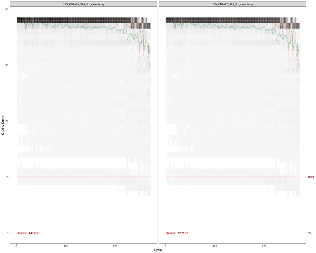
3.3 Filter and Trim
Now that we’ve set up our file paths and checked the quality of our
sequences, we can set them up for the DADA2 filter and trim
step. First, we create objects that will hold the file names of filtered
sequences based on the sample names we have provided. Then the
filterAndTrim command will filter the reads based upon the
following: read quality, read length, the number of Ns (i.e., unknown
bases) in a read, the maximum number of expected errors after truncating
the reads, and whether or not reads in your sample match the PhiX genome
(i.e., a small virus genome used as a control in Illumina sequencing
runs; more information here). The
maximum expected errors is calculated by solving for E in the Quality
Score equation (see above). We have also specified here that we would
like our output FASTQ files to be compressed, and that we can
multithread this filter and trimming process. Keep in mind that if you
are using a Windows to run your analyses locally, then
multithreading is not available for this step.
Soem crucial things to consider at this step are your read lengths (i.e., 2x250, 2x300), the locus and region(s) you’re sequencing, the per base quality of your sequences, the and whether you are using paired-end reads or just forward reads.
For the ITS1 and ITS2 genes, their
lengths vary so wildly that truncating the sequences based on a specific
length is not recommended. However, for the 16S gene,
its regions (i.e., V1-V9) are a bit more reliable in their average
lengths. The 16S V4 region varies between ~250 - 283
nucleotides in length (Illumina, n.d.;
Vargas-Albores et al. 2017), whereas the V3
region varies between ~130 to 190 nucleotides (Vargas-Albores et al. 2017). The
V3-V4 region ranges between ~400 - 470 nucleotides in
length. For more information, check out this DADA2 GitHub
issue as
well as Rausch et al. (2019) and Bukin et al. (2019).
Forward and reverse reads are merged if they have at least a 12 base pair overlap. If you are using paired-end reads, then your merged read lengths (considering the 12 nucleotide overlap) need to total up to these region lengths. For example, let’s say you’re truncating your 16S V3-V4 forward reads to 250 base pairs (bp) long and your reverse reads to 160 bp long. If your reads are merged, the total length will be 250 + (160-12) = 398 bp long. This total read length of 398 bp would be a decent minimum read length considering that the range of the 16S V3-V4 region is ~400 - 470 bp.
Lastly, when setting your expected errors per forward and reverse
reads (maxEE=c(R1,R2)), it is important to consider the per
base sequence quality of your reads. Because reverse reads typically
have lower per base sequence quality than your forward reads, you may
want to relax the expected errors for your reverse reads.
If few too reads are surviving this step, then consider changing your
expected errors per read parameter or adjusting the
truncLength of your reads. Referring to your FastQC and
eestats2 reports may be provide even more clarity for how you want to
define these paramters. For more information on the
filterAndTrim function, please view this documentation.
path # double check that your path is correct

# Create objects that will hold filtered file names in directory called "Filtered"
## these files will be created in the filter + trim step w/ filterAndTrim command
filtFs <- file.path(path, "Filtered", paste0(sample.names, "_F_filtered.fastq.gz"))
filtRs <- file.path(path, "Filtered", paste0(sample.names, "_R_filtered.fastq.gz"))

# giving these file.name elements the sames of the samples
names(filtFs) <- sample.names
names(filtRs) <- sample.names; save.image(file = "mydada_16S.V4.Rdata")

filtFs # let's see what this object looks like

# Filter & Trim!
out <- filterAndTrim(fnFs, filtFs, fnRs, filtRs, truncLen=c(250,235),
                     maxN=0, maxEE=c(2,3), truncQ=2, rm.phix=TRUE,
                     compress=TRUE, multithread=TRUE); save.image(file = "mydada_16S.V4.Rdata") # On Windows set multithread=FALSE

# filterAndTrim notes:
## The maxEE parameter sets the maximum number of “expected errors” allowed in a read, which is a better filter than simply averaging quality scores.
## Standard filtering parameters: maxN=0 (DADA2 requires no Ns), truncQ=2, rm.phix=TRUE and maxEE=2.
# truncLen=c(240,230) -- trim F reads to 240 bp, trim R reads to 230 bp
## Notes for trunc length of 2x300 PE reads: https://github.com/benjjneb/dada2/issues/236

head(out)
# * if you are only doing F reads, remove the "truncLen" command - truncLen=c(240,160) [for PE reads]
# sometimes there is a trimLeft=15 argument here, but I removed this because I already trimmed my sequences with bbduk
3.3.1 Learn the Error Rates
Dr. Callahan developed an algorithm for a parametric error model that
can use both inference and estimations to determine the error rates for
each sample. Here is the excerpt of Dr. Callahan describing this
function in his DADA2 tutorial.
The DADA2 algorithm makes use of a parametric error model (
err) and every amplicon dataset has a different set of error rates. The learnErrors method learns this error model from the data, by alternating estimation of the error rates and inference of sample composition until they converge on a jointly consistent solution. As in many machine-learning problems, the algorithm must begin with an initial guess, for which the maximum possible error rates in this data are used (the error rates if only the most abundant sequence is correct and all the rest are errors).
errF <- learnErrors(filtFs, multithread=TRUE); save.image(file = "mydada_16S.V4.Rdata")
errR <- learnErrors(filtRs, multithread=TRUE); save.image(file = "mydada_16S.V4.Rdata")
# The learnErrors method learns this error model from the data by alternating estimation of the error rates and inference of sample composition until they converge on a jointly consistent solution.
# As in many machine-learning (ML) problems, the algorithm must begin with an initial guess, for which the maximum possible error rates in this data are used (the error rates if only the most abundant sequence is correct and all the rest are errors)

plot_error<-plotErrors(errF, nominalQ=TRUE)## sanity check by visualizing estimated error rates -- should see error rates drop w/ increased quality
ggsave(plot_error,filename = "16S_errormodel_DADA2.pdf", width=15, height=15, dpi=600)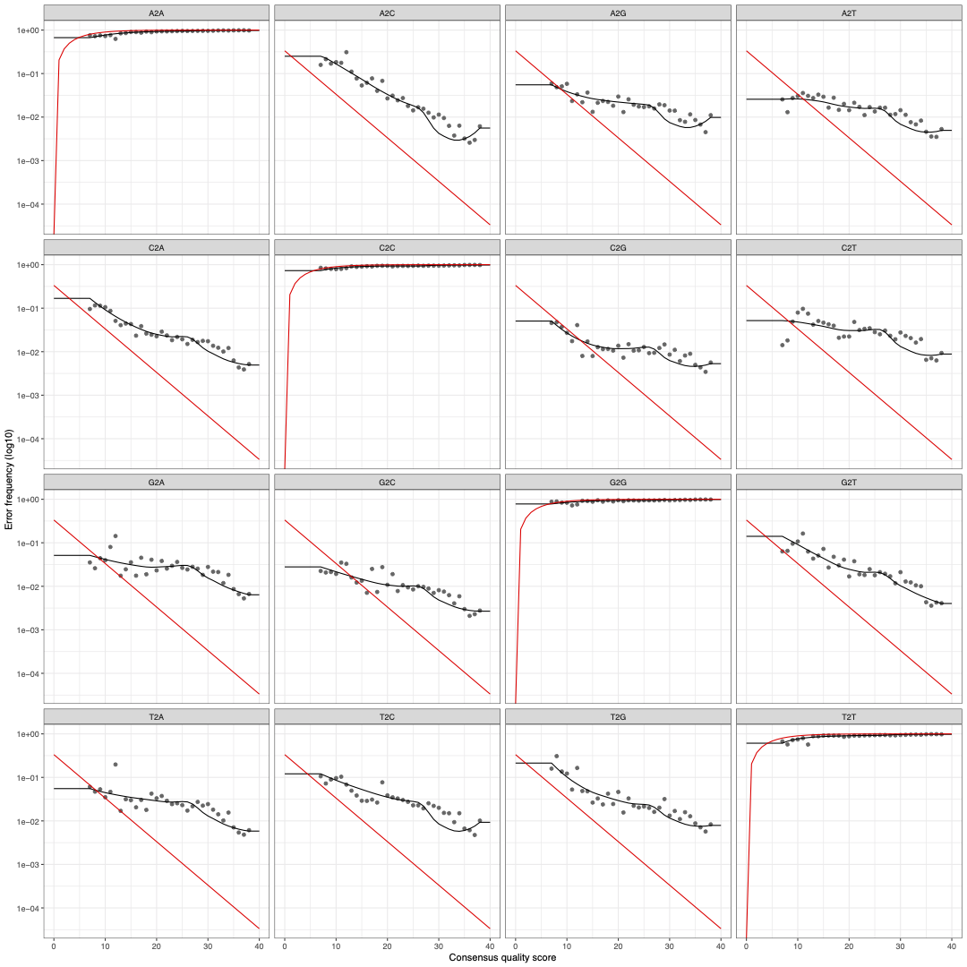
Once we have constructed the error model from the reads, we can plot the observed frequency of transitions from base to base (i.e., A2A indicates an A followed by an A) as a function of the consensus quality score at that position in the read. The individual points in black represent the observed error rates for each consensus quality score. The black line shows estimated error rates after convergence of the ML algorithm, and the red line shows error rates expected under the nominal definition of the Q-score. One thing we notice is that as consensus quality score increases, the error rates (black lines) decrease, which is expected.
If it seems like we are doing a lot of sanity checks throughout this workflow, it’s because we are! This process can take a while and require some trouble shooting, so it’s good to constantly check your work as you make your way through the workflow. Coding without sanity checks is never recommended.
3.3.2 Identify ASVs in Reads
Before we run the Divisive Amplicon Denoising Algorithm
(dada()), we have to remove the files from our
filtFs/filtRs objects that were dropped in the filtering
step. The algorithm will not work if we include file names of files that
do not actually exist in the Filtered directory.
Now it’s time to use the dada algorithm to infer our
amplicon sequence variants (ASVs) from our sequences. For more
information on how the Divisive Amplicon Denoising Algorithm works,
please see Callahan et al. (2016) and
Rosen et al. (2012). To increase the
signal of sequence variants with very low abundance across samples, you
can choose to pool (pool=TRUE) or pseudo-pool
(pool=pseudo) your sample sequences together.
The output of the algorithm will be a data-class object,
containing the number of ASVs inferred out of the number of total input
sequences.
filtFs <- filtFs[file.exists(filtFs)] # removes files that were not included in output because 0 reads passed filter step
filtRs <- filtRs[file.exists(filtRs)]
dadaFs <- dada(filtFs, err=errF, multithread=TRUE, pool=TRUE); save.image(file = "mydada_16S.V4.Rdata") # pseudo pooling is computationally more efficient but similar in results to pooling; pool = True will pool samples together before sample inference
dadaRs <- dada(filtRs, err=errR, multithread=TRUE, pool=TRUE); save.image(file = "mydada_16S.V4.Rdata")

dadaFs[1] # Returns first section of dada-class object {one sample}
The wonderful thing about ASVs is that because they are assigned based on 99% sequence identity, they are true representative of biological sequences and thus directly comparable across workflows (Prodan et al. 2020; Callahan, McMurdie, and Holmes 2017). I highly recommend reading these papers for more information on the benefits of using ASVs/ESVs/zOTUs.
3.4 Merge Forward + Reverse Reads
At this point in the workflow, we are now going to merge our denoised Forward and Reverse reads to get our contiguous sequences (i.e., contigs). Sequences will be merged if they share at least 12 nucleotides. These sequences must be identical to each other in these overlapping regions or else they will not be merged.
mergers <- mergePairs(dadaFs, filtFs, dadaRs, filtRs, verbose=TRUE); save.image(file = "mydada_16S.V4.Rdata")
head(mergers[[1]])
The mergers object is a data.frame
containing the merged sequence, its abundance, and some statistics about
the sequences themselves. If most of your reads do not merge, then you
should revisit the filter and trimming step. It could be that you cut
too much off of your sequencing reads, making it more difficult to
successfully merge your reads.
3.5 Create Sequence Table & Remove Chimeras
Let’s make an ASV table (similar to an OTU table but using ASVs), which will have our samples as rows and our ASVs as columns.
Using this table, we get a sense of how long our ASVs are and the distribution of these ASV lengths. We can also determine the percentage of reads that fall within our desired range of region lengths.
seqtab <- makeSequenceTable(mergers); save.image(file = "mydada_16S.V4.Rdata")
dim(seqtab)
table(nchar(getSequences(seqtab)))

# we can filter out ASVs that are not within our target range of lengths
seqtab2 <- seqtab[,nchar(colnames(seqtab)) %in% 250:290] # here looking at ASVs that are between 250 - 290 nucleotides long
dim(seqtab2)
table(nchar(getSequences(seqtab2)))

# how many reads fall within our desired length range
sum(seqtab2)/sum(seqtab)

# Look at merged sequences in a plot -- see their distribution and frequency of sequences of certain length
## x axis - total number of reads per sample; y axis - density of samples w/ specific # of total reads
compare_reads_plot1 = ggdensity(rowSums(seqtab), fill = "blue4", alpha = 0.7); save.image(file = "mydada_16S.V4.Rdata")
compare_reads_plot2 = ggdensity(rowSums(seqtab2), fill = "red4", alpha = 0.7)
comp_plots<-ggarrange(compare_reads_plot1, compare_reads_plot2,labels=c("All Reads", "Reads of Desired Length"),ncol=1, nrow=2)
ggsave(comp_plots,filename = "16S.V4_compare_total_reads.pdf", width=10, height=20, dpi=600)
dev.off()
3.6 Remove Chimeras
Now we are going to remove all chimeric sequences from our data.
Chimeras are the the result of two or more biological
sequences incorrectly joining together. This is often a result of PCR
for a number of reasons. In DADA2 specifically, chimeras
are identified if they can be reconstructed from right and left segments
from two or more “parent” sequences. The object
seqtab.nochim will be our sequence table with the chimeras
removed. Most of your reads should not be removed during this step.
However, according to the DADA2 FAQ page if you
have more than 25% of your reads removed, then it is likely that primers
are still attached to your sequences. Be sure to remove these primers in
the trimming step with either bbduk, cutadapt,
or trimmomatic and begin the workflow again.
seqtab.nochim <- removeBimeraDenovo(seqtab2, method="consensus", multithread=TRUE, verbose=TRUE); save.image(file = "mydada_16S.V4.Rdata")
# Chimeric sequences are identified if they can be exactly reconstructed by combining a left-segment and a right-segment from two more abundant “parent” sequences
dim(seqtab.nochim)
dim(seqtab)
dim(seqtab2)

sum(seqtab.nochim)/sum(seqtab) # comparing reads after chimera removal over total reads (after filtering)
sum(seqtab.nochim)/sum(seqtab2) # comparing reads after chimera removal over reads that are our desired length
3.7 Track the Reads - Sanity Check
Time for a sanity check and see how many reads we have at this point in our workflow. This is a great place to see if we have lost any reads, and at which steps they were lost - which can really help us determine if we trimmed our reads to the appropriate length. If a lot of reads are lost, it is recommended to check if primers and adapters are still attached to your sequences, and the truncation length of your sequences for the filter and trimming step.
getN <- function(x) sum(getUniques(x)) # function get number of unique sequences per object
track <- cbind(out, sapply(dadaFs, getN), sapply(dadaRs, getN), sapply(mergers, getN), rowSums(seqtab.nochim)); save.image(file = "mydada_16S.V4.Rdata")
# If processing a single sample, remove the sapply calls: e.g. replace sapply(dadaFs, getN) with getN(dadaFs) ;  sapply(dadaRs, getN), sapply(mergers, getN),
head(track)

colnames(track) <- c("input", "filtered", "denoisedF", "denoisedR", "merged", "nonchim") # remove whichever labels you didn't include
rownames(track) <- sample.names
head(track)

write.table(track,"16S_tracking_reads_dada2.txt",sep="\t",row.names=TRUE,col.names=TRUE); save.image(file = "mydada_16S.V4.Rdata")
3.8 Assign Taxonomy to ASVs
Now it’s time to assign taxonomic identities to our ASVs.
Dr. Callahan utilizes the naive Bayesian
classifier his assignTaxonomy function, which is the
same classifier used by the Ribosomal
Database Project (RDP) for taxonomic assignment. For more
information on how this classifier works, please read Wang et al. (2007).
In order to assign the taxonomic IDs to our ASVs, we need to have a reference database FASTA file to use as our known training data. These training data with known references will help the classifier determine which taxa our ASVs belong to. Currently the options for reference databases include the latest versions of the Silva database (for 16S), the Ribosomal Database Project database (for 16S), and the UNITE database (which should be used specifically for ITS sequences). A Green Genes database file is also included (for 16S analyses), but Green Genes has not been updated in a long time and thus is not the best choice for our reference training dataset. Dr. Callahan has included these reference database files here.
The assignTaxonomy() command has multiple arguments that
can be adjusted as described here. One
specific argument is tryRC, which is an option to try the
reverse complement of your sequences to query against your database of
choice. If tryRC=TRUE, then the reverse complement of the
query sequence will be used for taxonomic classification of the ASVs if
it is a better match to the reference than the forward (or original)
sequence. By default tryRC=FALSE, however if you
are analyzing ITS2 sequences and used the 5.8S-Fun/ITS4-Fun primer set
created by Taylor et al. (2016),
you must set tryRC=TRUE. This is because the “Illumina
forward adaptor and barcodes were added to the ITS4-Fun primer rather
than the 5.8S-Fun primer to avoid excessive hairpin formation” (Taylor et al. 2016). That means that your F and
R reads are in reverse orientation, and that the reverse complement of
these reads should be used when comparing these reads to the UNITE
database. Thank you to Dr.Fabiola
Pulido-Chavez for sharing this helpful info with me!
taxa <- assignTaxonomy(seqtab.nochim, "/bigdata/aronsonlab/shared/DADA2_Silva_Files/silva_nr99_v138.1_wSpecies_train_set.fa.gz", multithread=TRUE); save.image(file = "mydada_16S.V4.Rdata")

# ITS2 w/ Taylor et al 2016 5.8S-Fun/ITS4-Fun primers
# taxa <- assignTaxonomy(seqtab.nochim, "/bigdata/aronsonlab/shared/DADA2_Silva_Files/silva_nr99_v138.1_wSpecies_train_set.fa.gz", multithread=TRUE,tryRC=TRUE); save.image(file = "mydada_16S.V4.Rdata")

taxa.print <- taxa # Removing sequence rownames for display only
rownames(taxa.print) <- NULL
taxa.print<-as.data.frame(apply(taxa.print,2, function(x) gsub("[^.]__", "", x))) # remove leading letters and __ with gsub
head(taxa.print)
If you are only seeing taxonomic identification at the Phyla level
(i.e., the rest of the columns are filled with NAs), then
this could indicate that we have not trimmed our sequences correctly.
For example, let’s say we have reads that are 300bp long (from 2x300 PE
sequencing), but we are interested in the 16S V3 region which ranges
from ~ 130-190 nucleotides in length. If we have not trimmed our
sequences down to our desired region length (here 130-190 nucleotides),
then our merged reads are no longer reliable, and the classifier will
incorrectly identify our ASVs. Remember, the reads need to have at least
a 12 nucleotide overlap to merge - so if we are not trimming our reads
correctly, we could create merged sequences that are not accurate
representations of the regions we are trying to identify, which will
hurt us in the taxonomic assignment step.
3.9 Save DADA2 Output for future analysis
We have finished the DADA2 portion of the workflow! We
can save the output from DADA2 as R objects, text files,
and tsv files for future import into R.
First we create a vector of the ASV labels called
asv_headers that we will use to make the ASV IDs easier to
read. We then use a for loop to add an “ASV” prefix to our
asv_headers so that they are easily identifiable by an ASV
number instead of just a number to represent each ASV. We then combine
asv_headers with the sequences themselves to make an object
called asv_fasta, which now holds our ASV sequences and
their respective IDs.
# giving our seq headers more manageable names (ASV_1, ASV_2...)
asv_seqs <- colnames(seqtab.nochim)
asv_headers <- vector(dim(seqtab.nochim)[2], mode="character")
head(seqtab.nochim)
head(asv_headers)

for (i in 1:dim(seqtab.nochim)[2]) {
  asv_headers[i] <- paste(">ASV", i, sep="_")
}
asv_fasta <- c(rbind(asv_headers, asv_seqs))
Now we can save our ASV count table, our ASV taxonomy table, and the ASV sequences themselves as separate files and R objects. I wanted to provide several file options because some people have a preference as to how they import data into R.
# making and writing out a fasta file of our final ASV seqs w/ ASV IDs:
write(asv_fasta, "16S_ASVs_dada2.fa") # write fasta file
write.table(asv_fasta,"16S_ASVs_dada2.txt",sep="\t",row.names=TRUE,col.names=TRUE)

# ASV count table:
asv_counts <- t(seqtab.nochim)
row.names(asv_counts) <- sub(">", "", asv_headers)

# For Vegan format: sample IDs as rows, ASVs as columns
asv_tab<-t(asv_counts)
write.table(asv_tab, "16S.V4_ASVs_Table_dada2.tsv", sep="\t", quote=F, col.names=NA)
write.table(asv_tab,"16S.V4_ASVs_Table_dada2.txt",sep="\t",row.names=TRUE,col.names=TRUE)
# For Phyloseq format: ASVs as row IDs, sample IDs as columns
write.table(asv_counts, "16S.V4_ASVs_Counts_dada2.tsv", sep="\t", quote=F, col.names=NA)
write.table(asv_counts,"16S.V4_ASVs_Counts_dada2.txt",sep="\t",row.names=TRUE,col.names=TRUE)

# taxa ID table:
asv_tax <- taxa
row.names(asv_tax) <- sub(">", "", asv_headers)
write.table(asv_tax, "16S.V4_ASVs_Taxonomy_dada2.tsv", sep="\t", quote=F, col.names=NA)
write.table(asv_tax,"16S.V4_ASVs_Taxonomy_dada2.txt",sep="\t",row.names=TRUE,col.names=TRUE)

#### Save all ASV objects as R objects ####
saveRDS(asv_tax, file = "16S.V4_ASVs_Taxonomy_dada2_Robject.rds", ascii = FALSE, version = NULL,
        compress = TRUE, refhook = NULL)
saveRDS(asv_tab, file = "16S.V4_ASVs_Counts_dada2_Robject.rds", ascii = FALSE, version = NULL,
        compress = TRUE, refhook = NULL)
saveRDS(asv_fasta, file = "16S.V4_ASV_Sequences_dada2_Robject.rds", ascii = FALSE, version = NULL,
        compress = TRUE, refhook = NULL)

#### Save everything from global environment into .Rdata file
save.image(file = "mydada_16S.V4.Rdata")
Personally, I like using R objects (file extension .rds) in my
analyses. In order to import R objects into R, you can run
data.frame(readRDS("path/to/Robject.rds", refhook = NULL))
to create a data frame holding the contents of your R object file.
4 Statistical Analysis
At this point you should have either/or R objects, text files, and tsv files containing the following: 1. your ASV sequences in FASTA format, 2. your ASV count table, and 3. your ASV taxonomy table. You should also have some metadata for your samples that will allow for deeper investigation into your microbial data.
4.1 Import and Prepare Data for Analyses
First before we import any data, let’s make sure that we are in the
right directory (where our DADA2 files are stored) and that
have all of the necessary R libraries loaded.
getwd() # use setwd("path/to/files") if you are not in the right directory
suppressPackageStartupMessages({ # load packages quietly
  library(phyloseq)
  library(ggplot2)
  library(vegan)
  library(dendextend)
  library(ggpubr)
  library(scales)
  library(grid)
  library(ape)
  library(plyr)
  library(dplyr)
  library(readxl)
  library(dplyr)
  library(tidyr)
  library(reshape)
  library(reshape2)
  library(shades)
  library(microbiome)
  library(devtools)
  library(decontam)
  library(pairwiseAdonis)
  library(corrplot)
})
Now let’s import the DADA2 output into R for some
statistical analyses. We will import our ASV count table, our ASV
taxonomic table, and our metadata for this dataset. We are also going to
create an object called colorset1 to contain the color
labels for each of our categories. This will help us keep the colors
consistent for each category in all of our figures.
## Import bacterial ASV count data
bac.ASV_counts<-data.frame(readRDS("16S.V4_MSH_ASVs_Counts_dada2_9.20.2021_Robject.rds", refhook = NULL))
dim(bac.ASV_counts)
head(bac.ASV_counts)
colnames(bac.ASV_counts)<-gsub("X1", "1", colnames(bac.ASV_counts)) # shorten sample names to match sample names in metadata file
bac.ASV_counts$ASV_ID<-rownames(bac.ASV_counts)
head(bac.ASV_counts)

## Import metadata
metadata<-as.data.frame(read_excel("MSH_MappingFile_for_Workflow.xlsx"), header=TRUE)
head(metadata)
#metadata<-na.omit(metadata) # drop NAs from metadata
head(metadata)
metadata$SampleID<-gsub("(\\_.*?)\\_([0-9])","\\1.\\2", metadata$SampleID) # replace second _ with .
rownames(metadata)<-metadata$SampleID

# create color variable(s) to identify variables by colors
## color for Category
colorset1 = melt(c(ClearCutSoil="#D00000",Gopher="#f8961e",NoGopher="#4ea8de",OldGrowth="#283618"))

colorset1$Category<-rownames(colorset1)
colnames(colorset1)[which(names(colorset1) == "value")] <- "Category_col"
colorset1

metadata<-merge(metadata, colorset1, by="Category")
head(metadata)
metadata$Category_col <- as.character(metadata$Category_col)
rownames(metadata)<-metadata$SampleID

## Import ASV taxonomic data
bac.ASV_taxa<-data.frame(readRDS("16S.V4_MSH_ASVs_Taxonomy_dada2_9.20.2021_Robject.rds", refhook = NULL))
head(bac.ASV_taxa)

bac.ASV_taxa[is.na(bac.ASV_taxa)]<- "Unknown" # turn all NAs into "Unkowns"
bac.ASV_taxa$Species<-gsub("Unknown", "unknown", bac.ASV_taxa$Species) # change uppercase Unkonwn to lowercase unknown for unknown species classification
head(bac.ASV_taxa)
bac.ASV_taxa$ASV_ID<-rownames(bac.ASV_taxa) # create ASV ID column to use for merging data frames
head(bac.ASV_taxa)
With our data imported, we now need to remove any potential
contaminates from our ASV table. These are ASVs that were identified in
your positive and negative controls. Fortunately we can use the
decontam() package to do this and create new, “clean” ASV
count and taxonomy tables (Davis et al.
2018). Be sure to have a column in your metadata that tells you
exactly which samples are controls. For information on how to properly
use decontam(), view the tutorial here.
NOTE: In the particular project we are using for this workflow, there were NO PCR or sequencing controls included. Running the code below will lead to an error. Please use the following section of code as a guide for removing decontaminants in your ASV counts data frame.
## Identify & Remove Contaminants

# Create a df that contains which samples in your data set are positive/negative controls
ControlDF<-metadata[metadata$SampleType=="Control",]

# create a vector for the decontam() pacakge that tells us which sames are controls (TRUE) or not (FALSE)
vector_for_decontam<-metadata$Sample_or_Control # use for decontam package

#convert bac.ASV_counts data frame to numeric
bac.ASV_counts[,-length(bac.ASV_counts)] <- as.data.frame(sapply(bac.ASV_counts[,-length(bac.ASV_counts)], as.numeric))

# transpose so that rows are Samples and columns are ASVs
bac.ASV_c2<-t(bac.ASV_counts[,-length(bac.ASV_counts)])

# create data frame of which ASVs are contaminants are not
contam_df <- isContaminant(bac.ASV_c2, neg=vector_for_decontam)

table(contam_df$contaminant) # identify contaminants aka TRUE

# pull out ASV IDs for contaminating ASVs
contam_asvs <- (contam_df[contam_df$contaminant == TRUE, ])

# see which taxa are contaminants
bac.ASV_taxa[row.names(bac.ASV_taxa) %in% row.names(contam_asvs),]

## Create new files that EXCLUDE contaminants!!!

# making new fasta file (if you want)
#contam_indices <- which(asv_fasta %in% paste0(">", contam_asvs))
#dont_want <- sort(c(contam_indices, contam_indices + 1))
#asv_fasta_no_contam <- asv_fasta[- dont_want]

# making new count table
bac.ASV_counts_no.contam <- bac.ASV_counts[!row.names(bac.ASV_counts) %in% row.names(contam_asvs), ] # drop ASVs found in contam_asvs
head(bac.ASV_counts_no.contam)

# making new taxonomy table
bac.ASV_taxa.no.contam <- bac.ASV_taxa[!row.names(bac.ASV_taxa) %in% row.names(contam_asvs), ] # drop ASVs found in contam_asvs
head(bac.ASV_taxa.no.contam)

# Remove ASVs found in Controls from samples (in addition to contaminants previously ID'd)

Control_counts<-bac.ASV_counts_no.contam[,colnames(bac.ASV_counts_no.contam) %in% ControlDF$SampleID] # see which taxa are contaminants
Control_counts
Control_counts<-Control_counts[which(rowSums(Control_counts) > 0),] # drop ASVs that don't appear in Controls
dim(Control_counts)
head(Control_counts)

bac.ASV_counts_CLEAN<-bac.ASV_counts_no.contam[!bac.ASV_counts_no.contam$ASV_ID %in% row.names(Control_counts),!colnames(bac.ASV_counts_no.contam) %in% colnames(Control_counts)]
bac.ASV_taxa_CLEAN<-bac.ASV_taxa.no.contam[!bac.ASV_taxa.no.contam$ASV_ID %in% row.names(Control_counts),]

# sanity check
colnames(bac.ASV_counts_CLEAN) # check for control sample IDs

## and now writing them out to files
#write(asv_fasta_no_contam, "ASVs-no-contam.fa")
write.table(bac.ASV_counts_CLEAN, "data/EnvMiSeq_W23_16S.V3V4_ASVs_Counts_NoContam.tsv",
            sep="\t", quote=F, col.names=NA)
saveRDS(bac.ASV_counts_CLEAN, file = "data/EnvMiSeq_W23_16S.V3V4_ASVs_Counts_NoContam_Robject.rds", ascii = FALSE, version = NULL,
        compress = TRUE, refhook = NULL)

write.table(bac.ASV_taxa_CLEAN, "data/EnvMiSeq_W23_16S.V3V4_ASVs_Taxa_NoContam.tsv",
            sep="\t", quote=F, col.names=NA)
saveRDS(bac.ASV_taxa_CLEAN, file = "data/EnvMiSeq_W23_16S.V3V4_ASVs_Taxa_NoContam_Robject.rds", ascii = FALSE, version = NULL,
        compress = TRUE, refhook = NULL)
4.1.1 Data Formatting, Filtering, and Transformation
Now that we have imported our ASV count table, our ASV taxonomy
table, and our metadata, we can start to reformat the actual data
objects in R to get them ready for running through the
vegan suite of tools. First we are going to merge our ASV
count table and our ASV taxonomy tables together and filter out some
unwanted taxa.
Even though we are analyzing bacterial data, sometimes chloroplast and mitochondrial sequences are attributed to 16S genes. For example, in the Silva database, Chloroplast sequences attributed to Eukaryotes are found within the databases’ set of Cyanobacteria sequences. Some sequences within this Chloroplast distinction are actually labeled as bacteria, but they have not been phylogenetically connected to a reference genome. It’s important to filter our these eukaryotic sequences before we start playing with statistical analyses. We are also going to drop any ASVs that do not have any counts as well as “singletons”, which are ASVs with only 1 count in the entire data set.
NOTE: Here we are merging the original ASV counts
and ASV taxa data frames. If you followed the decontam()
step, you should be merging the CLEAN versions of these objects. There
is a commented-out line of code in the section below that shows this
step.
# first we merge the ASV count object and the ASV taxonomy object together by column called "ASV_ID"
# merge CLEAN aka contaminants/controls removed count & taxa tables

#bac.ASV_all<-merge(bac.ASV_counts_CLEAN,bac.ASV_taxa_CLEAN, by="ASV_ID")
bac.ASV_all<-merge(bac.ASV_counts,bac.ASV_taxa, by="ASV_ID")
head(bac.ASV_all)
dim(bac.ASV_all)
bac.ASV_all<-bac.ASV_all[, !duplicated(colnames(bac.ASV_all))] # remove col duplicates
dim(bac.ASV_all)

bac.ASV_dat<-melt(bac.ASV_all)
head(bac.ASV_dat)

# rename columns
colnames(bac.ASV_dat)[which(names(bac.ASV_dat) == "variable")] <- "SampleID"
colnames(bac.ASV_dat)[which(names(bac.ASV_dat) == "value")] <- "Count"

# Drop all Zero counts & singletons ASVs
dim(bac.ASV_dat)
bac.ASV_dat<-bac.ASV_dat[which(bac.ASV_dat$Count > 0),]
dim(bac.ASV_dat)

# Drop Unknowns and Eukaryotic hits
bac.ASV_dat<-subset(bac.ASV_dat, Kingdom!="Unknown") ## drop Unknowns from Kingdom
bac.ASV_dat<-subset(bac.ASV_dat, Phylum!="Unknown") ## drop Unknowns from Phylum
head(bac.ASV_dat)
dim(bac.ASV_dat)

# Create ASV count file that is filtered of eukaryotic taxa - for later use just in case
bac.ASV_dat.with.euks<-bac.ASV_dat
colnames(bac.ASV_dat.with.euks)

# Drop chloroplast & mitochondria seqs
bac.ASV_dat<-subset(bac.ASV_dat, Class!="Chloroplast") ## exclude Chloroplast sequences
bac.ASV_dat<-subset(bac.ASV_dat, Order!="Chloroplast") ## exclude Chloroplast sequences
bac.ASV_dat<-subset(bac.ASV_dat, Family!="Mitochondria") ## exclude Mitochondrial sequences just in case

# check if Eukaryotic and Unknowns are still in your data, this may take a while to run!
'Chloroplast' %in% bac.ASV_dat # check if Chloroplast counts are still in df, should be false because they've been removed
'Mitochondria' %in% bac.ASV_dat # check if Mitochondria counts are still in df, should be false because they've been removed
'Undetermined' %in% bac.ASV_dat # check if undetermined taxa in data frame
#NA %in% bac.ASV_dat

head(bac.ASV_dat)
After dropping unknown or undesired sequences from our combined ASV
data frame, it’s time to create an ASV table that is properly formatted
for the vegan package. This ASV table must be a
Samples x Species matrix, in which our Sample IDs as
our row names and our ASV IDs as our column names.
NOTE: We could have made this ASV table earlier
immediately after importing the ASV count data by transposing the table
with the t() function. However, I want to have an ASV table
that excludes taxa I do not want in my data set, like ASVs attributed to
Chloroplast sequences or ASVs attributed to unknown Phyla.
bac.ASV_table<-as.data.frame(dcast(bac.ASV_dat, SampleID~ASV_ID, value.var="Count", fun.aggregate=sum)) ###
head(bac.ASV_table)
rownames(bac.ASV_table)<-bac.ASV_table$SampleID
bac.ASV_table<-subset(bac.ASV_table, select=-c(SampleID))
head(bac.ASV_table)
Now we can reformat our metadata to be in the same order (by rows) as
our ASV table. This is a crucial step! Though it may
appear minor, certain functions (such as adonis2() for
example) will not correctly analyze your data if your metadata and your
ASV table are not arranged in the same order by rows. This next step
will only work if the two data frames we are reordering have the same
number of rows AND the same row names.
# double check dimensions of metadata and ASV table
dim(metadata)
dim(bac.ASV_table)
# double check that the rownames exist + match
rownames(metadata)
rownames(bac.ASV_table)

# Find rows in metadata that are not in ASV table, and vice versa --> sanity check
setdiff(rownames(metadata), rownames(bac.ASV_table)) # check rows in metadata not in bac.ASV_table
setdiff(rownames(bac.ASV_table), rownames(metadata)) # check rows in bac.ASV_table not in metadata

# reorder metadata based off of ASV table
metadata=metadata[rownames(bac.ASV_table),]
# here we are reordering our metadata by rows, using the rownames from our ASV table as a guide
# this indexing method will only work if the two dfs have the same # of rows AND the same row names!

# sanity check to see if this indexing step worked
head(metadata)
head(bac.ASV_table)
Before we jump into statistically analyzing our sequence data, we will want to standardize our environmental data. You may have multiple environmental variables that you’ve recorded (i.e., temperature, pH, dissolved oxygen concentration, etc.), all of which could be in different units or vary widely in their relative concentrations, variances, etc. It’s important that we scale and center our environmental variables so that we can compare variables of different units/concentrations/etc.
head(metadata)
meta_scaled<-metadata
meta_scaled[,17:19]<-scale(meta_scaled[,17:19],center=TRUE,scale=TRUE) # only scale chem env data
head(meta_scaled)
Now that all of our files are in R and correctly formatted, we can start some statistical analyses!
4.2 Alpha Diversity & Species Richness
4.2.1 Rarefaction Curves
To calculate species richness and alpha diversity (using the
Shannon-Wiener index), we will use functions from the vegan
package
(Oksanen et al. 2020). Before I get to the
alpha diversity and species richness, I will calculate a rarefaction
curve for my ASV table. The rarefaction curve tells us that after
resampling a pool of N individuals per sample (x-axis), we will identify
a certain number of species in said sample (y-axis). This can give us an
idea if any sample is more/less species rich than other samples, which
can be useful to identify outliars.
sort(colSums(bac.ASV_table))
png('rarecurve_example.png',,width = 1000, height = 900, res=100)
rarecurve(as.matrix(bac.ASV_table), col=metadata$Category_col, step=1000, label=F,ylab="ASVs")
# to show sampel labels per curve, change label=T
dev.off()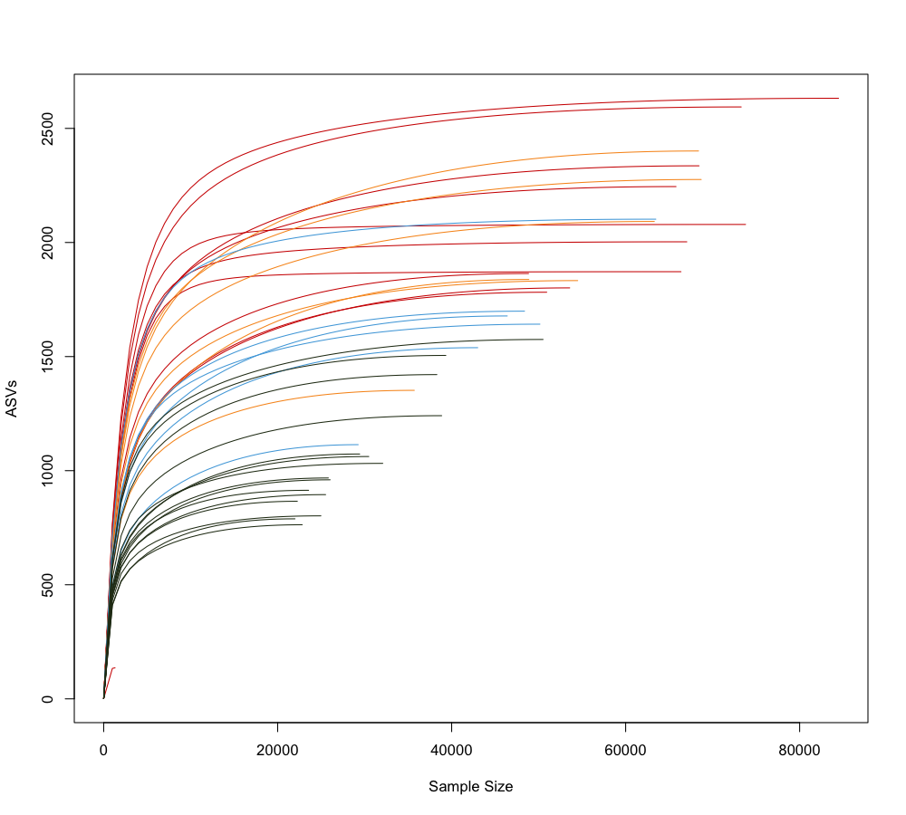
In this rarefaction curve, each curve is colored based on its sample category: red represents “Clear Cut Soil”, yellow represents the “Gopher” category , light blue represents the “No Gopher” category, and dark green represents “Old Growth” soil. Based on this rarefaction curve, it appears that samples within the Old Growth category have a smaller, average sample size compared to the other sample categories.
4.2.2 Shannon Diversity & Species Richness
Now that I’ve viewed the rarefaction curve and looked for outliers, we can move onto the alpha diversity and species richness steps.
For alpha diversity and species richness measurements, we are going to use raw data. The use of raw data for any kind of analysis is quite controversial because not all of the samples have the same number of observations: for example, one of our samples may have thousands of ASV counts, whereas other samples can be much smaller or larger than that. Transforming our data can allow us to view the actual distribution of our data, revealing patterns that may have been difficult to observe in the raw data. You can find a helpful example of data transformations and the benefits via its respective Wikipedia page.
Some microbiologists would tell you that we should rarefy our data before moving onto any diversity assessments or downstream analyses. Rarefying is a type of data transformation that involves finding the sample with the minimum number of counts in all of your samples, then scaling all of your sample counts down to this size. As described with the rarefaction curve, rarefying allows you to see 1. the number of species across samples and 2. the abundance of said species across samples when sampling based on a given minimum. Historically, rarefaction was the strategy used to transform microbial data. However, more recently many statisticians have advised against rarefaction as we tend to lose a lot of information regarding low abundance OTUs/ASVs. For more information on why rarefaction is not a useful transformation method, please read “Waste Not, Want Not: Why Rarefying Microbiome Data is Inadmissable” by McMurdie and Holmes (2014).
When we get to the section on calculating beta diversity, I will provide more insight into which transformation method(s) I use and why.
Alpha diversity is a way to measure within-sample diversity, using an
equation that considers the richness of certain species as well as the
evenness of those species. The vegan package has a
diversity() function that allows one to specify which
diversity index the user would like to use for calculating alpha
diversity. Here I use the Shannon-Wiener index for calculating alpha
diversity. In order to calculate Shannon Diversity, we have to calculate
Shannon Entropy, then take calculate the exponential value of the
Shannon Entropy (e to the power of Shannon Entropy). We can
also calculate species richness (i.e., how many species are present in
each sample) using the specnumber() function from the vegan
package. Once we’ve found species richness and Shannon diversity, we can
combine these values into one data frame, then merge this data frame
with our metadata to create one dataframe containing: Shannon entropy,
Shannon diversity, species richness, and your sample metadata.
# if you have another package loaded that has a diversity function, you can specify that you want to use vegan's diversity function as shown below
Shan_ent.16s<-vegan::diversity(bac.ASV_table, index="shannon") # Shannon entropy
Shan_div.16s<- exp(Shan_ent.16s) # Shannon Diversity aka Hill number 1

# create data frame with Shannon entropy and Shannon diversity values
div_16s<-data.frame(Bac_Shannon_Entropy=Shan_ent.16s,Bac_Shannon_Diversity=Shan_div.16s)
class(div_16s)
div_16s$SampleID<-rownames(div_16s)
head(div_16s)

# create a data frame with species richness
S_16s<-data.frame(Bac_Species_Richness=specnumber(bac.ASV_table), SampleID=rownames(bac.ASV_table)) # finds # of species per sample using RAW count data; if MARGIN = 2 it finds frequencies of species

# merge richness and diversity dataframes together
d.r_16s<-merge(div_16s, S_16s, by.x="SampleID", by.y="SampleID")

# merge w/ metadata
bac.div.metadat <- merge(d.r_16s,metadata, by.x="SampleID", by.y="SampleID")
head(bac.div.metadat)
class(bac.div.metadat) # want data frame
We can now use the data frame we made with our alpha diversity,
species richness, and our metadata to create some nice figures. First
want to ensure that the category of interest (i.e., in this example that
will be “Category”) is the right class of variable for
generating this figure. Because we are using a categorical identifier,
it is wise for us to make sure that our Category variable
is in the factor format.
unique(bac.div.metadat$Category) # see how many elements there are in the Category variable
bac.div.metadat$Category <- factor(bac.div.metadat$Category, levels = c("ClearCutSoil","Gopher","NoGopher","OldGrowth"))
class(bac.div.metadat$Category)
Now let’s make some pretty figures with ggplot2 (Wickham 2016)! Using ggplot2, we
can specify what type of plot to make, the color palette you’ll use, the
size(s) of your font, etc. If you’re interested in everything that
ggplot2 can do, please check out this amazing
ggplot2 Cheat
Sheet. We are also using ggpubr, a wrapper for
ggplot2 that allows for easy manipulation and export of
ggplot figures. For more information on
ggpubr, please check out the package website.
Here we are going to create box-and-whisker plots of our alpha
diversity and species richness data. The first plot will display the
alpha diversity across of our groups, and the second plot will display
the species richness of these groups. The y-axis will show
the Shannon diversity in the first plot, and the species richness in the
second plot. For both plots, the x-axis will display the
Category labels.
Each of the individual box-and-whisker plots will be assigned a
different color based on the Category variable using the
$Category_col variable we created earlier.
# shannon diversity by year
bac.a.div<-ggplot(bac.div.metadat, aes(x=Category, y=Bac_Shannon_Diversity, fill=Category)) +
  geom_boxplot(color="black")+scale_x_discrete(labels=c("ClearCutSoil"="Clear Cut Soil", "Gopher"="Gopher", "NoGopher"="No Gopher", "OldGrowth"="Old Growth"))+
  scale_fill_manual( values=unique(bac.div.metadat$Category_col[order(bac.div.metadat$Category)]), name ="Sample Category", labels=c("ClearCutSoil"="Clear Cut Soil", "Gopher"="Gopher", "NoGopher"="No Gopher", "OldGrowth"="Old Growth"), )+
  theme_classic()+

  labs(title = "Bacterial Shannon Diversity by Sample Category", x="Category", y="Shannon Diversity", fill="Category")+theme(axis.title.x = element_text(size=13),axis.title.y = element_text(size=13),axis.text = element_text(size=11),axis.text.x = element_text(vjust=1),legend.title.align=0.5, legend.title = element_text(size=13),legend.text = element_text(size=11),plot.title = element_text(hjust=0.5, size=15))

ggsave(bac.a.div,filename = "Bacterial_alpha_diversity.png", width=12, height=10, dpi=600)

# ggplot code break down:
# ggplot(bac.div.metadat, aes(x=Category, y=Bac_Shannon_Diversity, fill=Category)) -- dataset is bac.div.metadat; set aesthetics aka x variable, y variable, and variable for filling in box-whisker plots
# geom_boxplot(color="black") -- outline of box-whisker plots will be black
# scale_x_discrete(labels=c()) -- fix the labels of groups in x-axis
# theme_classic() -- removes grid lines in background of figure
# labs() -- fix plot labels
# theme(...) -- these are changing the settings of the fig: setting axis title size, legend title size, alignment of axes and legend labels, etc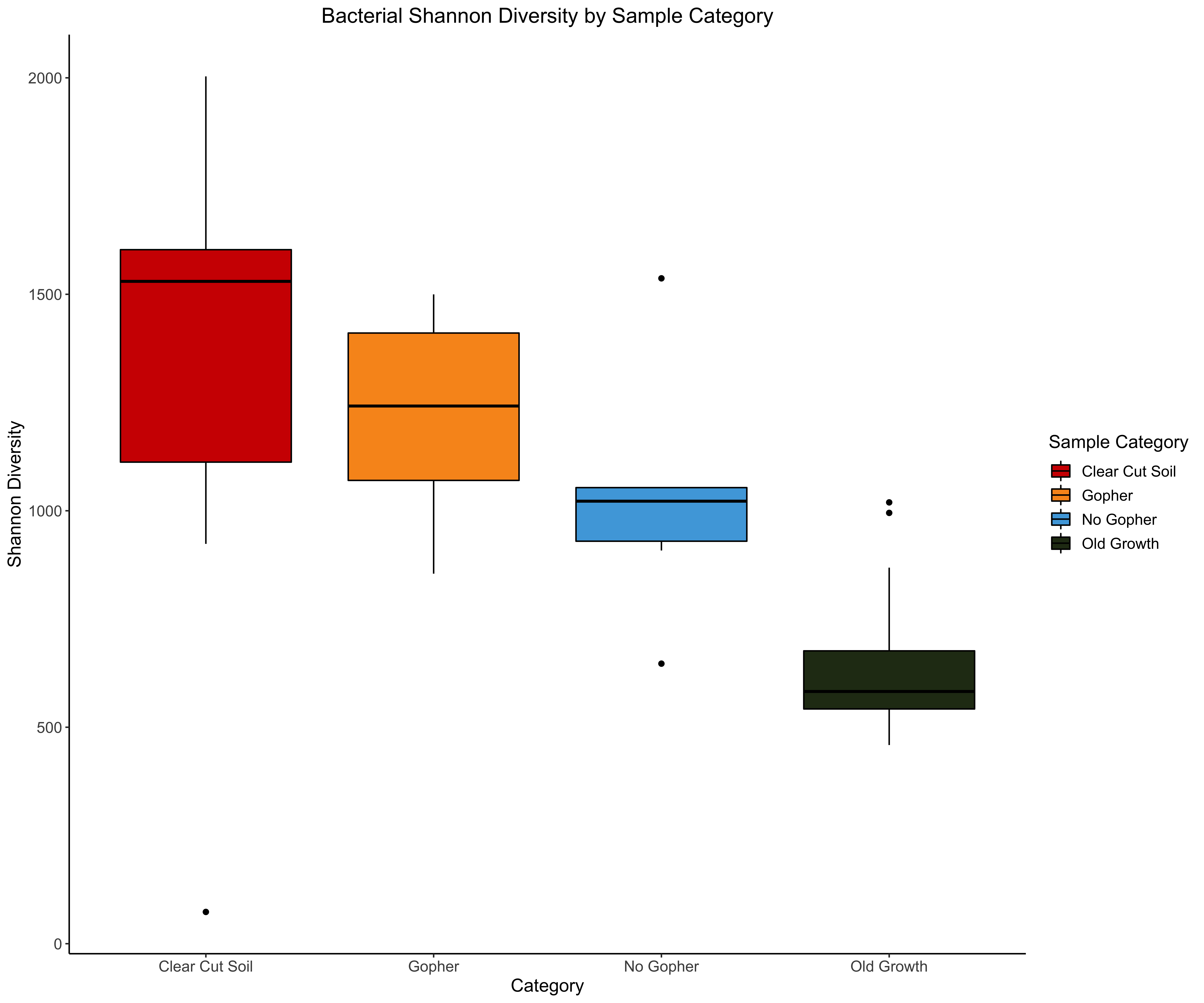
We observe the highest average Shannon diversity within the Clear Cut Soil category, followed by the Gopher category, then the No Gopher category, and the Old Growth category. Though this figure is helpful for comparing these categories to one another, we cannot really glean meaningful statistical inforamtion from this boxplot.
Not only does ggpubr help us with arranging and saving
figures, but we can also use some if its functions to add statistics
directly onto our figures with ease. In the next code chunk we use a
function called stat_compare_means() which allows you to
compare different sets of samples to each other. Because we have already
assigned our samples to Categories, we can compare the means across our
multiple samples.
We can compare the means of each sample to each other in a pair-wise
fashion by using either a T-test (t.test)
or a using a Wilcoxon test (wilcox.test),
or compare the means across all of our samples at once using an
Analysis of Variance aka ANOVA (anova) or
a Kruskal-Wallis test (kruskal.test). For
more information on how to use the stat_compare_means()
function to add statistics to your plots, please see this website.
Deciding on whether to use a T-test verses a Wilcoxon test, or an ANOVA verses a Kruskal-Wallis test, depends on whether your data fulfills certain assumptions held by these statistical tests. One of the assumptions for a T-test and an ANOVA is that the data is normally distributed. We can test for normality using the Shapiro-Wilk test.
The null hypothesis for the Shapiro-Wilk test is that the data is normally distributed. This means that if your p-value for the Shapiro-Wilk test is > 0.05, then the null hypothesis is accepted and the data is in fact normally distributed. However, if p is < 0.05, then the null hypothesis is rejected and your data are not normally distributed.
We can also use a Q-Q plot to compare our data with a theoretical normal distribution. These plots show the quantiles for our data in the y-axis, and the theoretical quantiles for a normal distribution on the x-axis. If our data points lie on the line in the Q-Q plot, then the data is considered normally distributed. Skewed data will contain points that are further from the line, curving one way or another.
Let’s run a Shapiro-Wilks test using our species richness results, and use a Q-Q plot to see the distribution of these richness values.
NOTE: diversity and richness are usually not normally distributed, but it’s still important to always see how the data are distributed if you plan on running statistical tests that assume normality.
## Using Shapiro-Wilk test for normality
shapiro.test(bac.div.metadat$Bac_Species_Richness) # what is the p-value?
# my example p-value was p-value = 0.4429

# visualize Q-Q plot for species richness
png('qqplot.png',,width = 1000, height = 900, res=100)
qqnorm(bac.div.metadat$Bac_Species_Richness, pch = 1, frame = FALSE)
qqline(bac.div.metadat$Bac_Species_Richness, col = "steelblue", lwd = 2)
dev.off()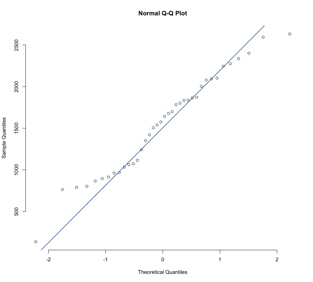
Because our p-value for the Shapiro-Wilks test is > 0.05, we’ve determined that our species richness values are not normally distributed. Because of this, we will use a Wilcoxon test (rather than a T-test) to compare the means of our sample groups in a pairwise fashion. Because we only have two groups in this example, we cannot run an Kruskal-Wallis test. Kruskal-Wallis tests and ANOVAs are used when comparing three or more groups.
In the boxplot below, I have only included a few pairwise group
comparisons as to not overwhelm the plot. If you’d rather use
* as indicators of statistical significance instead of
using the p-values themselves, you can change the label parameter in the
stat_compare_means() function from "p.format"
to "p.signif".
bac.spec.rich<-ggplot(bac.div.metadat, aes(x=Category, y=Bac_Species_Richness, fill=Category)) +geom_boxplot(color="black")+scale_x_discrete(labels=c("ClearCutSoil"="Clear Cut Soil", "Gopher"="Gopher", "NoGopher"="No Gopher", "OldGrowth"="Old Growth"))+theme_bw()+scale_fill_manual( values=unique(bac.div.metadat$Category_col[order(bac.div.metadat$Category)]), name ="Sample Category", labels=c("ClearCutSoil"="Clear Cut Soil", "Gopher"="Gopher", "NoGopher"="No Gopher", "OldGrowth"="Old Growth"), )+theme_classic()+labs(title = "Bacterial Species Richness by Sample Category", x="Category", y="Species Richness", fill="Category")+theme(axis.title.x = element_text(size=13),axis.title.y = element_text(size=13),axis.text = element_text(size=11),axis.text.x = element_text(vjust=1),legend.title.align=0.5, legend.title = element_text(size=13),legend.text = element_text(size=11),plot.title = element_text(hjust=0.5, size=15))+stat_compare_means(comparisons = list(c(3,4), c(2,3), c(1,4)), hide.ns = FALSE,label = "p.signif",method="wilcox.test")+stat_compare_means(label.y=3600)

ggsave(bac.spec.rich,filename = "Bacterial_species_richness.png", width=12, height=10, dpi=600)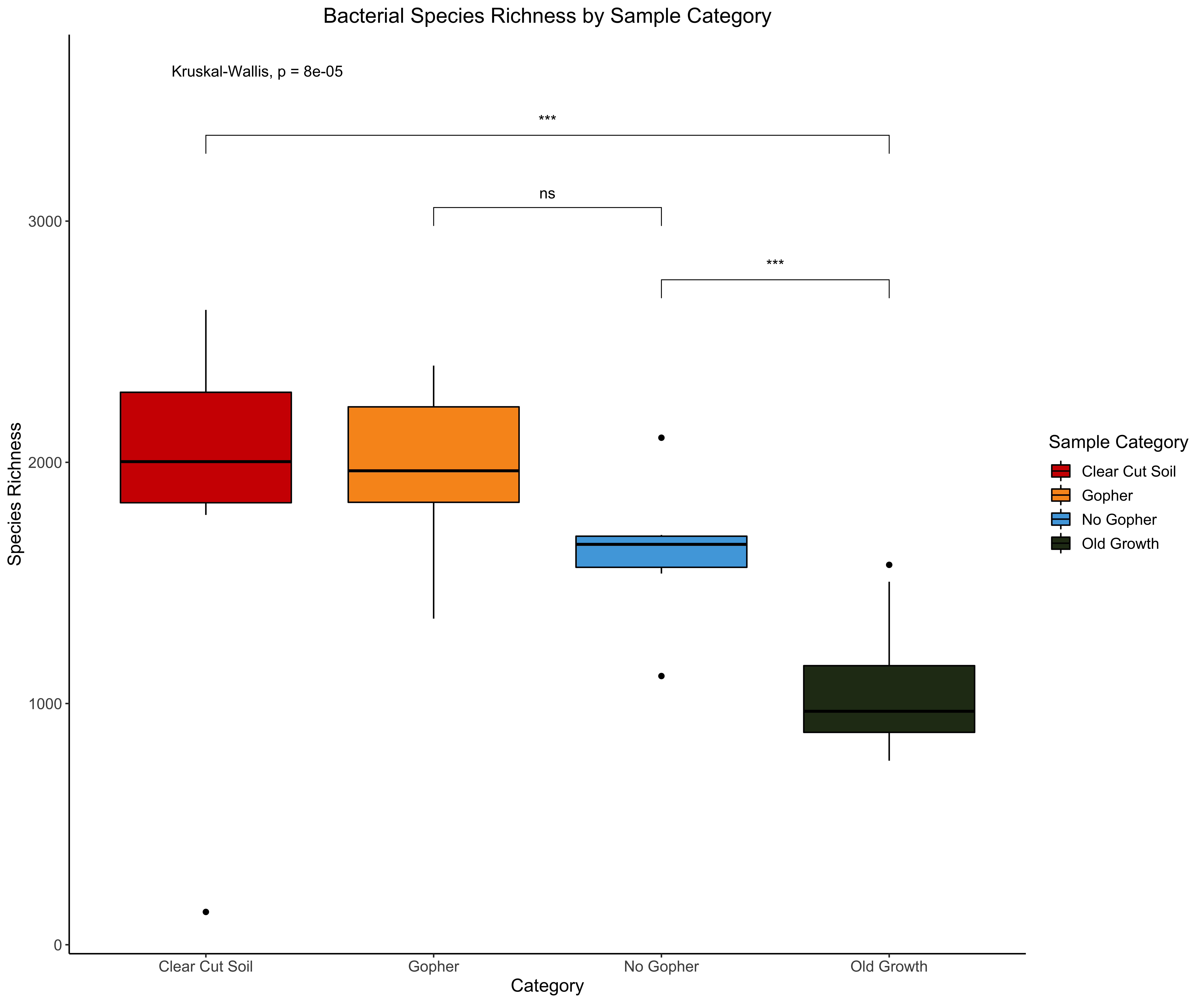
I did not want to overwhelm you with multiple pairwise group
comparisons on this figure, so you are only seeing the results of three
Wilcoxon tests comparing Clear Cut Soil to Old Growth samples, Gopher to
No Gopher samples, and No Gopher to Old Growth Samples. The
* indicate significance levels, with * being
p <= 0.05, ** being p <= 0.01,
*** is p <= 0.001, and **** is
p <= 0.0001. The symbol ns stands for not
significant. Figure 8c shows us that the Clear Clut Soil samples
have a significantly higher average Species Richness than the Old Growth
samples. We can also see that our No Gopher samples are significantly
higher in species richness than the Old Growth samples, but the
difference between the species richness averages in the Gopher verses No
Gopher samples is not statistically significant. You can also see a
printed value for the Kruskal-Wallis test, which here is p = 0.00008.
This test indicates that there is a significant difference in average
species richness across all of the sample categories.
4.3 Beta Diversity
4.3.1 Data Transformation
Before going any further, we should transform our data. Data transformation helps us to better interpret our data by changing the scales in which we view our data, as well as reducing the impact of skewed data and/or outliers in our data set. We can also perform a transformation that normalizes our data, aka changing the distribution of our data to be a normal (i.e., Gaussian) distribution, which is useful for running certain statistical tests that assume normality (like T-tests, ANOVAs). For more on why you should transform your data and what kind of transformations are out there, check out the resources included in this very helpful Medium article. I have also found this Medium article on log transformations helpful as well.
Two useful transformations I have seen used are the variance stabilizing transformation (i.e, VST) and the centered log-ratio transformation (i.e, CLR). For information on how to employ this particular transformation, please check out this tutorial by the legendary bioinformatician Dr. Mike Lee. Though I won’t be using the VST transformation, I have not found any literature saying that the CLR transformation is better than VST. The CLR transformation appears to be popular among statisticians, which is why I am choosing to go this route.
We will use the vegan package to CLR transform our count
data for creating clustering dendrograms and ordinations. The CLR
transformation is recommended in the paper “Microbiome Datasets Are
Compositional: And This Is Not Optional” by Gloor
et al. (2017), which proposes that microbiome data sets are
compositional, meaning they describe relationships between multiple
components. Gloor et al. (2017) argues
that the reason that CLR transformations are ideal for compositional
data is because 1. ratio transformations are useful for detecting
relationships in both count data and proportion data, and 2. because
log-ratios specifically make the data symmetric in a log space.
It’s important to change all of the 0s in our ASV table to a very
small number so that the log of 0 is not taken in our transformation
(Quinn and Erb (2021)). To account for
this, we include the pseudocount = 1 argument in the
decostand() function, which will add a small pseudocount to
the cells in our matrix containing 0s. To better understand
how CLR transformation works and why its a useful transformation for
microbiome data, watch this great YouTube video
created by Dr. Thomas Quinn and
read “Normalization and microbial differential abundance strategies
depend upon data characteristics” by Weiss et al.
(2017). For more information on the pros and cons of the CLR
transformation, please read “A field guide for the compositional
analysis of any-omics data” by Quinn et al.
(2019).
4.3.2 Hierarchical Clustering
Now that we have our CLR-transformed ASV counts, we can create a Euclidean distance matrix that will describe how close (aka similar) our samples are to each other based on their microbial composition. The Euclidean distance between CLR-Transformed compositional data is known as Aitchison Distance (Quinn et al. 2018).
# check rownames of CLR transformed ASV data & metadata
rownames(b.clr) %in% rownames(meta_scaled)
meta_scaled=meta_scaled[rownames(b.clr),] ## reorder metadata to match order of CLR data

# calculate our Euclidean distance matrix using CLR data (aka Aitchison distance)
b.euc_dist <- dist(b.clr, method = "euclidean")

# creating our hierarcical clustering dendrogram
b.euc_clust <- hclust(b.euc_dist, method="ward.D2")

# let's make it a little nicer...
b.euc_dend <- as.dendrogram(b.euc_clust, hang=0.1)
b.dend_cols <- as.character(metadata$Category_col[order.dendrogram(b.euc_dend)])
labels_colors(b.euc_dend) <- b.dend_cols

png(file="16S_CLR_cluster_Category.png",width = 1000, height = 900, res=100)
par(cex=1)
plot(b.euc_dend, ylab="CLR Euclidean Distance") + title(main = "Bacteria/Archaea Clustering Dendrogram", sub = "Colored by Sample Category", cex.main = 2, font.main= 2, cex.sub = 0.8, font.sub = 3)
legend("topright",legend = c("Clear Cut Soil", "Gopher", "No Gopher", "Old Growth"),cex=.8,col = c("#D00000", "#f8961e", "#4ea8de", "#283618"),pch = 15, bty = "n")
dev.off()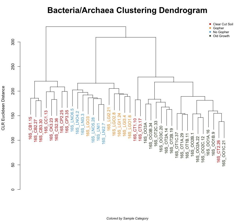
Though there are some samples not clustered within their sample categories, overall it appears that samples from specific categories form distinct clusters. This indicates thats generally, samples from the same category have similar microbial community composition. We can also see that most of the samples in the Clear Cut Soil category are more similar to the Gopher and No Gopher samples compared to the Old Growth samples. Though this dendogram is helpful, it’s not as informative as other visualizations we can do.
4.3.3 Principal Coordinate Analysis (PCoA)
To learn more about how these sample categories’ microbiomes compare to one another, we can use our Euclidean distance matrix (created from CLR transformed ASV counts) to generate an ordination known as Principal Coordinate Analysis, aka a PCoA.
I am not going to get into the math behind a PCoA, but you can learn more by watching this excellent StatQuest YouTube video and this helpful link that describes what a PCoA is and its uses. If you’re interested in learning more about ordinations in general and the impacts they can have on microbiome data, please read “Uncovering the Horseshoe Effect in Microbial Analyses” by Morton et al. (2017).
Generally a PCoA is used at looking at how similar your samples are to each other, and the variability exhibited by your samples, in a reduced dimensional space. The closer two points are in your ordination, the more similar they are. PCoAs yield multiple axes (i.e., principal components) that capture the variation within your data set and are associated with certain values (i.e., eigenvalues) that represent to the magnitude of the variation for each axis. These eigenvalues are relative representations of how important each axis of variation is for describing the data set.
PCoAs were developed so that we can create these ordinations using distances that are NOT Euclidean, for example like Bray-Curtis dissimilarity distances. PCoAs come from Principal Component Analysis, which is specifically used for Euclidean distances. For more information on PCAs, check out this StatQuest YouTube video as well as this tutorial that compares PCAs to PCoAs.
One reason PCoAs are often preferred over PCAs in microbial ecology is that PCAs are very sensitive to the presence of 0s, which is something we experience with microbial amplicon sequence data. For example, if two samples are missing ASV 1 and ASV 2, these two samples could be interpreted as being similar based on the species they are missing, not the species they share. For more on comparing PCAs to PCoAs, please check out this link.
Let’s generate our PCoA and a PCA and check out the proportion of variance explained by our axes. The reason I am showing you how to generate both is because a PCoA using Euclidean distances is equivalent to a PCA. This is a useful way to confirm that our data is actually Euclidean in nature.
# let's use our Euclidean distance matrix from before to generate a PCoA
b.pcoa <- pcoa(b.euc_dist)

# Variance explained by each axis is the Relative eigen (values$Relative_eig)
b.pcoa$values$Relative_eig

b.pca = prcomp(b.clr)
# Variance explained by each axis is the Proportion of Variance
b.pca.sum<-summary(b.pca)
b.pca.sum$importance
The first axis (PC1) of variation describes 8.94% of the variance in the entire data set. The second axis (PC2) describes 5.69% of the variation. Our PC axes generated by our PCoA are equivalent to our axes generated by the PCA, which is to be expected using Euclidean distances. The first 2-3 axes describe the greatest amount of variation in the data set, and are included in the visualization of the PCoA.
To visualize our PCoA with ggplot2, we have to extract
the principal coordinates for each sample across our axes of variation
and combine these values with our metadata. Then we can make a PCoA
ordination and color each sample ID with our variable of interest (in
this case, the Sample Category, aka metadata$Category). We
can also include the relative variation for each axis in our x-axis and
y-axis labels.
# extract principal coordinates
b.pcoa.vectors<-data.frame(b.pcoa$vectors)
b.pcoa.vectors$SampleID<-rownames(b.pcoa$vectors)

# merge pcoa coordinates w/ metadata
b.pcoa.meta<-merge(b.pcoa.vectors, metadata, by.x="SampleID", by.y="SampleID")
head(b.pcoa.meta)

b.pcoa$values$Relative_eig # pull out relative variation % to add to axes labels

# create PCoA ggplot fig
pcoa1<-ggplot(b.pcoa.meta, aes(x=Axis.1, y=Axis.2)) +geom_point(aes(color=factor(Category)), size=4)+theme_bw()+labs(title="PCoA: Bacteria/Archaea",subtitle="Using Centered-Log Ratio Data",xlab="Axis 1", ylab="Axis 2",color="Sample Category")+theme_classic()+ theme(axis.title.x = element_text(size=15),axis.title.y = element_text(size=15),legend.title.align=0.5, legend.title = element_text(size=15),axis.text = element_text(size=12),axis.text.x = element_text(vjust=1),legend.text = element_text(size=12),,plot.title = element_text(size=17))+guides(shape = guide_legend(override.aes = list(size = 5)))+scale_color_manual(name ="Sample Category", labels=c("ClearCutSoil"="Clear Cut Soil", "Gopher"="Gopher", "NoGopher"="No Gopher", "OldGrowth"="Old Growth"),values=unique(b.pcoa.meta$Category_col[order(b.pcoa.meta$Category)])) +xlab("Axis 1 [8.94%]") + ylab("Axis 2 [5.69%]")

ggsave(pcoa1,filename = "16S_pcoa_CLR.png", width=12, height=10, dpi=600)

## ggplot code break down:
# guides(shape = guide_legend(override.aes = list(size = 5))) -- make shapes in legend bigger
# scale_color_manual(name =, labels=c(),values=unique(b.pcoa.meta$Category_col[order(b.pcoa.meta$Category)])) -- organize color variable in our data frame by the category its associated with
# xlab() -- x-axis label
# ylab() -- y-axis label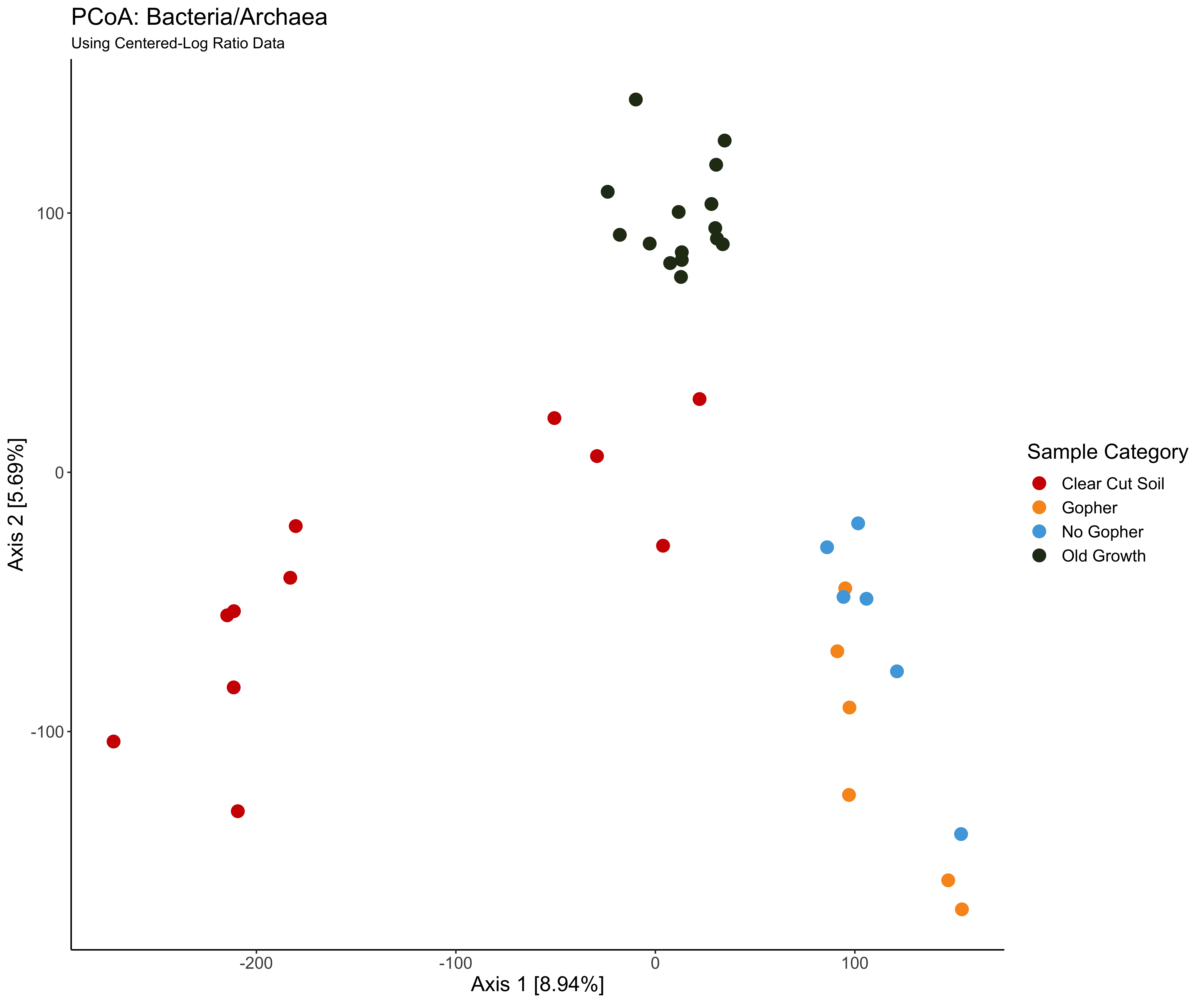
From this PCoA we can tell that the microbial community composition in the Old Growth samples are similar to one another, forming a tight cluster in the PCoA (points in dark green). The microbial composition of the Clear Cut Soil samples are also similar to one another (points in red). Interestingly, the Gopher and No Gopher samples cluster together, indicating that their microbial communities are similar to each other, regardless of whether a gopher was introduced to the soil or not. It is important to keep in mind that though we see distinct clusters by sample category, the variation explained by this variable is quite low (Axis 1 - 8.94%, Axis 2 - 5.59%).
So this information is helpful, but we are not sure if our categories are significantly similar/dissimilar from each other. To do this, we first need to check the dispersion (aka variance) of the composition data within each group to see if we can even compare these groups to each other. Basically we are finding the spatial median or the centroid of each group in multivariate space, and calculating the distance from each point to the centroid within a respective group or category. The actual distances are reduced to principal coordinates (as is done in a PCA or PCoA) before the distances from each group are compared. We then can use an ANOVA as well as a Tukey’s Honest Signifcant Difference Test (aka Tukey’s HSD) to statistically compare the group dispersions.
To check out our group dispersions and whether or not they are
homogeneous (equal/similar to each other in their variance), we will use
the betadisper() function from the vegan
package. We can then compare the axes of dispersion with the
anova() function and compare the spatial means with the
TukeyHSD() function.
# create CLR Sample x Species matrix for input into dist()
b.clr<-as.matrix(t(asv_clr))
rownames(b.clr)
rownames(metadata)
# reorder the transformed ASV table to match order of metadata data frame
b.clr=b.clr[rownames(metadata),] # reorder both dfs by row names
# sanity check
rownames(b.clr)
rownames(metadata)

# calculate our Euclidean distance matrix using CLR data (aka Aitchison distance)
b.euc_dist <- dist(b.clr, method = "euclidean")
b.disper<-betadisper(b.euc_dist, metadata$Category)
b.disper

permutest(b.disper, pairwise=TRUE) # compare dispersions to each other via permutation test to see significant differences in dispersion by pairwise comparisons

anova(b.disper) # p = 0.0001394 --> reject the Null H, spatial medians are significantly difference across Categories

TukeyHSD(b.disper) # tells us which Category's dispersion MEANS are significantly different than each other
The ANOVA results tell us that our dispersions by category are
significantly different than each other (p=0.0001394), meaning the
variance within each category is not homogenous. We can visualize this
comparison as well via an ordination (calculated by
betadisper()) and a boxplot based on the distance to the
centroid for each group.
# Visualize dispersions
png('pcoa_betadispersion.png',width = 700, height = 600, res=100)
plot(b.disper,main = "Centroids and Dispersion based on Aitchison Distance", col=colorset1$Category_col)
dev.off()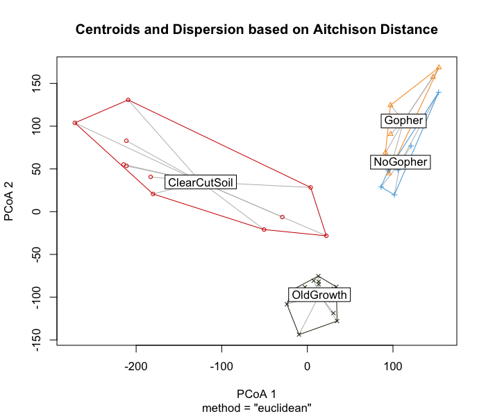
betadisper().
Colored by Sample Category
png('boxplot_centroid_distance.png',width = 700, height = 600, res=100)
boxplot(b.disper,xlab="Sample Category", main = "Distance to Centroid by Category", sub="Based on Aitchison Distance", names=c("Clear Cut Soil", "Gopher", "No Gopher", "Old Growth"), col=colorset1$Category_col)
dev.off()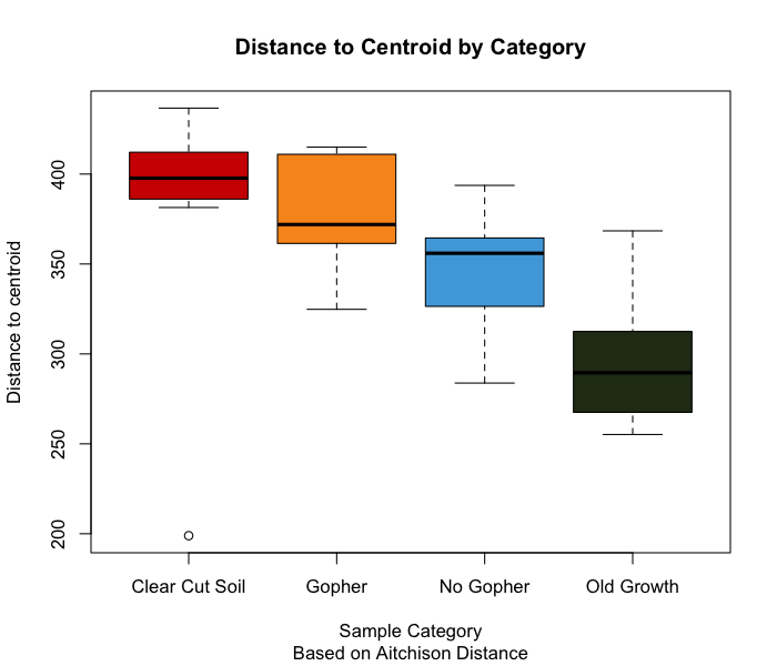
The reason that our dispersion results are problematic is that if we try to compare the groups using a Permutational Analysis of Variance (aka a PERMANOVA), the significant differences we may see between groups could be attributed to their unequal variances (i.e., dispersion effects) rather than actual differences in the community compositions by category.
4.3.4 PERMANOVA w/ Aitchison Distance
A PERMANOVA is similar to an ANOVA in that both analyses compare differences between groups (using sum-of-squares), but a PERMANOVA runs multiple permutations to compare these distances to each other - whereas an ANOVA is comparing group averages to each other without the use of permutations. Another difference is that while ANOVAs assume that the data is normally distributed, the PERMANOVA assumes that the groups have equal variance (dispersion). For more information on PERMANOVAs and comparing group variances, check out this very helpful link by Dr. Joshua Ebner.
Even though we should not run a PERMANOVA with these data, let’s go
over how we would run a PERMANVOA. The most crucial thing about
running a PERMANOVA in R is that your feature table and your metadata
need to be in the same order by row! The program does not know
to match up sample IDs or labels to each other, so you have to confirm
that your data frames are arranged in the same way by row before running
the PERMANOVA. We can then run our PERMANOVA including multiple
variables of interest. We can see if there are interactions between
multiple variables and our compositional data respectively with
+ (i.e, var1 + var2), or we can check for
interactions between our variables and our composition data with
* (i.e, var1 * var2).
NOTE: Using adonis2() with
Continuous Variables! The variation explained is directly
analogous to that of general linear models. With a
continuous variable, the PERMANOVA acts like simple linear regression,
where each point is associated with its own “centroid” which is the best
fit linear approximation. For a more in-depth explanation of this,
please check out this link.
# check your rownames and the order of the rownames for ordering step
rownames(b.clr)
rownames(metadata)
# in case you need to reorder
b.clr=b.clr[rownames(metadata),]
# sanity check
rownames(b.clr)
rownames(metadata)

# PERMANOVA requires assumption of homogenous within-group disperions to ensure observed differences in groups are real
perm1<-adonis2(b.clr ~ Category, data = metadata, permutations = 999, method="euclid", by='terms') # looks for interactions between predictor variables
perm1

perm2<-adonis2(b.clr ~ Category*layer, data = metadata, permutations = 999, method="euclid", by='terms')
# * -> for interactions between predictor variables; + -> interactions with multiple variables but not between them or combined interactions
perm2
adonis2(b.clr ~ Category+layer, data = metadata, permutations = 999, method="euclid", by='terms')

# export PERMANOVA results to csv
perm1_results<-data.frame(DF=perm1$Df, SumofSqs=perm1$SumOfSqs, R2=perm1$R2, F=perm1$F, p=perm1$`Pr(>F)`)
rownames(perm1_results)<-rownames(perm1)
perm1_results
write.csv(perm1_results,"16S_PERMANOVA_Results.csv",row.names=TRUE)

# save PERMANOVA results in a nice table
tab <- ggtexttable(perm1_results, theme = ttheme("light"))
tab2<- tab %>%
  tab_add_title(text = "PERMANOVA Results: Composition ~ Category", face = "bold", padding = unit(1, "line")) %>%
  tab_add_footnote(text = "Using Euclidean Distance of CLR-Transformed Data (Aitchison Distance)", size = 10, face = "italic")

# save table as png
png('permanova_table_test.png',width = 700, height = 600, res=200)
tab2
dev.off()
As predicted by the betadisper() results, we are seeing
a significant difference in community composition between our groups.
Again, for this data set we can’t really know if these differences are
meaningful because the within-group disperions (aka variances) are NOT
homogenous - so the significance we are seeing here is likely due to
dispersion effects rather than real differences between groups.
4.4 Relative Abundance
So we know our microbial communities are similar to each other if they’re from the same sample category, and that the microbiomes from each category are quite different from each other…but what about the actual taxa within those communities? Calculating the relative abundance allows us to determine how abundant certain taxa are compared to the rest of the taxa within a specific sample. In order to get a better sense of the microbial community in our samples, we need to calculate the relative abundance at varying taxonomic levels. We can also calculate the relative abundance by group; for example, we can determine the relative contribution of taxa 1 compared to the rest of the microbial commiunity in Group A.
Let’s merge our ASV taxonomy table to our metadata table. This will help us create a data frame that we can use to get the sum of our ASV counts across specific taxonomic levels.
NOTE: Here we are merging the original ASV counts
and ASV taxa data frames. If you followed the decontam()
step, you should be merging the CLEAN versions of these objects. There
is a commented-out line of code in the section below that shows this
step.
#bac.all<-merge(bac.ASV_counts_CLEAN, bac.ASV_taxa_CLEAN, by="ASV_ID")
# bac.all<-merge(bac.ASV_counts, bac.ASV_taxa, by="ASV_ID")
head(bac.ASV_all)
bac_melt<-melt(bac.all, id.vars = c("ASV_ID", "Kingdom", "Phylum", "Class", "Order", "Family", "Genus", "Species"))
head(bac_melt)
names(bac_melt)[which(names(bac_melt) == "variable")] <- "SampleID"
names(bac_melt)[which(names(bac_melt) == "value")] <- "Counts"
head(bac_melt)

head(metadata)

all_bac<-merge(bac_melt, metadata, by = "SampleID")
head(all_bac) # contains metadata, ASV counts, and taxonomic IDs for ASVs
Using the all_bac data frame containing our data and
metadata altogether and the dcast() function from the
reshape2 package (Wickham
2007), we can create data frames that contain counts by taxonomic
levels. We will then use these data frames to get the relative abundance
at specific taxonomic levels. Because I am using a bacterial data set, I
am only going to calculate the relative abundance at the phyla and class
levels. Though we could get deeper taxonomic resolution, the
visualization at these levels can be really overwhelming because there
are SO many taxa present.
Remember that when calculating your relative abundance, each count per taxa in each sample is divided by the sum of all the counts for that sample. This means that when you sum up all of the relativized values for each sample, they should sum up to 1. We can use this fact to help us check whether our relativization worked.
# use dcast to count up ASVs within each Phylum across all of the samples
b.phyla_counts <- as.data.frame(dcast(all_bac, SampleID~Phylum, value.var="Counts", fun.aggregate=sum)) ###
head(b.phyla_counts) # counts by phyla per sample
rownames(b.phyla_counts)<-b.phyla_counts$SampleID

b.phyla_RelAb<-data.frame(decostand(b.phyla_counts[,-1], method="total", MARGIN=1, na.rm=TRUE))
# relative abundance of taxa data where everything is divided by col total (b/c Margin=1 meaning rows == SAMPLES in this case)
rowSums(b.phyla_RelAb) # sanity check to make sure the transformation worked! All rowsums should = 1

b.phyla_RelAb$SampleID<-rownames(b.phyla_RelAb)
head(b.phyla_RelAb)
write.csv(b.phyla_RelAb,"16S_Phyla_Relative_Abundance.csv",row.names=TRUE) # good to save just in case

# melt down relativized data to merge with metadata
b.phyla_m<-melt(b.phyla_RelAb)

head(b.phyla_m)
colnames(b.phyla_m)[which(names(b.phyla_m) == "variable")] <- "Phylum"
colnames(b.phyla_m)[which(names(b.phyla_m) == "value")] <- "Counts"
head(b.phyla_m) ## relative abundance based on sum of counts by phyla!

b.phyla_RA_meta<-merge(b.phyla_m,metadata, by="SampleID")
head(b.phyla_RA_meta) ## relative abundance based on sum of counts by phyla!
Now that we have our relativized phyla counts, let’s visualize the relativized counts by phyla using a stacked barplot.
b.phy_RA<-ggplot(b.phyla_RA_meta, aes(x=SampleID, y=Counts, fill=Phylum))+geom_bar(stat="identity",colour="black")+scale_x_discrete()+theme_classic()+
  labs(title = "Microbial Phylum Relative Abundance", x="SampleID", y="Relative Abundance", fill="Phylum")+
  theme(axis.title.x = element_text(size=13),axis.title.y = element_text(size=13),axis.text = element_text(size=11),axis.text.x = element_text(vjust=1,angle=90),legend.title.align=0.5, legend.title = element_text(size=13),legend.text = element_text(size=11),plot.title = element_text(size=15))

ggsave(b.phy_RA,filename = "16S_phyla_RA.png", width=17, height=10, dpi=600)
We can see that across samples, the two most relatively abundant phyla are Abditibacteriota in coral, and Proteobacteria in light purple. Though this is helpful, it’s hard to determine which categories our samples belong to.
head(all_bac)
# by class + elevation
bac.cls <- as.data.frame(dcast(all_bac,SampleID~Class, value.var="Counts", fun.aggregate=sum)) ###
head(bac.cls) # counts by class + elevation
rownames(bac.cls)<-bac.cls$SampleID

b.RA_cls<-data.frame(decostand(bac.cls[,-1], method="total", MARGIN=1, na.rm=TRUE))
# relative abundance of taxa data where everything is divided by margin total (default MARGIN = 1 = rows) -- rows = samples
# bac.cls.cat[,-1] -- drop first column to not be included in relative abundance calculation

rowSums(b.RA_cls) # sanity check
b.RA_cls$SampleID<-rownames(b.RA_cls)
head(b.RA_cls)

#melt down relativized data to merge with metadata
b.cls_m<-melt(b.RA_cls, by="SampleID")

head(b.cls_m)
colnames(b.cls_m)[which(names(b.cls_m) == "variable")] <- "Class"
colnames(b.cls_m)[which(names(b.cls_m) == "value")] <- "Counts"
head(b.cls_m) ## relative abundance based on sum of counts by class!
4.4.1 Taxonomic Summaries
Now that we have calculated the relativized counts by class according to our sample categories, let’s visualize it! Instead of a stacked barplot, we could visualize this in a different way - shout out to Dr. Mike Lee for sharing this technique in his amplicon tutorial!
Dr. Lee visualized the proportions of gene copies recovered in a way that he calls taxonomic summaries. These summaries allow us to view the relative abundance (or gene copy number, or any abundance measurement) of our microbes by having our x-axis be the taxa themselves rather than the sample IDs or the group labels. Personally I find these taxonomic summaries useful for comparing the relative abundance of specific taxa across multiple groups. To provide an example that’s easy to look at, we are going to view microbial classes by category that have a relative abundance of at least 1% or higher per sample.
cat_meta<-unique(data.frame("Category"=metadata$Category, "Category_col"=metadata$Category_col, "SampleID"=metadata$SampleID))
cls_cat_meta<-merge(cat_meta,b.cls_m, by="SampleID")
head(cls_cat_meta)

# Subset data to include only classes with relative abundance > 1%
cls_cat.1<-subset(cls_cat_meta, cls_cat_meta$Counts>0.01)

ts1<-ggplot(cls_cat.1, aes(Class, Counts)) +
  geom_jitter(aes(color=factor(Category)), size=2, width=0.15, height=0) + scale_color_manual(name ="Sample Category", labels=c("ClearCutSoil"="Clear Cut Soil", "Gopher"="Gopher", "NoGopher"="No Gopher", "OldGrowth"="Old Growth"),values=unique(cls_cat_meta$Category_col[order(cls_cat_meta$Category)])) + geom_boxplot(fill=NA, outlier.color=NA) + theme_classic() + theme(axis.title.x = element_text(size=13),axis.title.y = element_text(size=13),axis.text = element_text(size=11),axis.text.x = element_text(vjust=1,angle=90),legend.title.align=0.5, legend.title = element_text(size=13),legend.text = element_text(size=11),plot.title = element_text(size=15),plot.subtitle = element_text(size=12)) + labs(x="Microbial Class", y="Relative Abundance", title="Bacteria/Archaea & Sample Category", subtitle="Only Including Taxa with Relative Abudance > 1%")

ggsave(ts1,filename = "16S_Class_1percent_RA_category.png", width=12, height=10, dpi=600)
This taxonomic summary tells us that Old Growth samples have a higher relative abundance (>20-40%) of the Acidimicrobiia class compared to samples belonging to the other categories. Gammaproteobacteria appears to be the most abundant class in Clear Cut Soil samples, with some samples having a relative abundance of this taxa that is greater than 20%. Interestingly, these samples from the Clear Cut Soil category are the only samples contain Bacilli, though this could be due to our 1% relative abundancer threshold for this figure.
4.4.2 Relative Abundance by Category
Maybe it would be helpful to know the relative abundance of taxa by the categories themselves rather than the relative abundance by sample. We can easily calculate this and visualize a stacked barplot to compare sample categories.
head(all_bac)
# by class + elevation
bac.cls.cat <- as.data.frame(dcast(all_bac,Category~Class, value.var="Counts", fun.aggregate=sum)) ###
head(bac.cls.cat) # counts by class + elevation
rownames(bac.cls.cat)<-bac.cls.cat$Category

b.RA_cls.cat<-data.frame(decostand(bac.cls.cat[,-1], method="total", MARGIN=1, na.rm=TRUE))
# relative abundance of taxa data where everything is divided by margin total (default MARGIN = 1 = rows) -- rows = samples
rowSums(b.RA_cls.cat) # sanity check
b.RA_cls.cat$Category<-rownames(b.RA_cls.cat)
head(b.RA_cls.cat)

#melt down relativized data to merge with metadata
b.cls.cat_m<-melt(b.RA_cls.cat, by="Category")

head(b.cls.cat_m)
colnames(b.cls.cat_m)[which(names(b.cls.cat_m) == "variable")] <- "Class"
colnames(b.cls.cat_m)[which(names(b.cls.cat_m) == "value")] <- "Counts"
head(b.cls.cat_m) ## relative abundance based on sum of counts by class!

# Subset data to include only classes with relative abundance > 1%
b.cls.cat.1<-subset(b.cls.cat_m, b.cls.cat_m$Counts>0.01)

c1<-ggplot(b.cls.cat.1, aes(x=Category, y=Counts, fill=Class))+geom_bar(stat="identity",colour="black")+scale_x_discrete(labels=c("ClearCutSoil"="Clear Cut Soil", "Gopher"="Gopher", "NoGopher"="No Gopher", "OldGrowth"="Old Growth"))+theme_classic()+
  labs(title = "Microbial Class Relative Abundance", x="Sample Category", y="Relative Abundance", fill="Class", subtitle="Only Including Taxa with Relative Abudance > 1%")+
  theme(axis.title.x = element_text(size=13),axis.title.y = element_text(size=13),axis.text = element_text(size=11),axis.text.x = element_text(vjust=1),legend.title.align=0.5, legend.title = element_text(size=13),legend.text = element_text(size=11),plot.title = element_text(size=15),plot.subtitle = element_text(size=13))

ggsave(c1,filename = "16S_Class_1percent_RA_byCategory.png", width=12, height=10, dpi=600)
Instead of viewing the relative abundance of classes by sample as we did in the taxonomic summary, we are now looking at the relativea abundance of taxa within the categories themselves. For example, we can tell that out of all of the categories, samples within the Old Growth category have the highest relative abundance of the Acidobacteriae class. Gammaproteobacteria appears to be the most abundant in the Clear Cut Soil category, whereas Bacteroidia is the most abundant class in the No Gopher category. Though our taxonomic summaries helped us to see these trends, these stacked bar plots offer some more insight to category-specific trends.
4.5 Environmental Drivers
The last step in this workflow is to determine how our microbial community composition corresponds to environmental variables. To do this, we can run either a Canonical Correspondence Analysis (aka CCA) or a Redundancy Analysis (aka RDA). These are ordination techniques that allow us to correlate our composition data with our environmental variables to explain the variance in our microbial community structures. CCAs and RDAs utilize eigenanalysis, which is quite out of the scope of this tutorial. I highly recommend watching this YouTube video detailing what eigenvectors and eigenvalues are and why they’re essential in linear algebra and statistics.
A CCA considers how community composition relates to a set of defined constraints, which would be your environmental variables of interests. CCAs assume that your composition data will have a unimodal (aka have one maximum value) relationship with the environmental variables. Typically for a CCA you already know exactly what environmental variables you will be considering. It’s important to note that if your model (how your environmental variables influence your community composition) is not statistically significant, then your results are not meaningful enough to discuss.
A RDA can tell us whether our environmental variables explain the variation we observe in our microbial communities, or whether or not their impact on community structure is redundant (i.e., the variation is explained by something else). RDAs assume that your composition data will have a linear relationship with your environmental data. Variance described by our environmental response variables is known as constrained variance, whereas variance described by unknown variables (or variables excluded from our response variables) is called unconstrained variance.
So at this point you’re probably asking yourself “how do I know if my data has a unimodal or linear relationship with my environmental variables?”, and that’s a great question! We can use a Detrended Correspondence Analysis (aka DCA) to help us decide whether we should use a CCA or an RDA for our composition data. If the length of our first DCA axis is longer than 4, that indicates that our data is heterogeneous and requires unimodal methods like a CCA. If the length of our first DCA axis is less than 3, the data is considered homogeneous and thus requires linear methods like an RDA. If your first axis length is between 3 and 4, then it’s up to you to choose whether to use an RDA or a CCA.
For more information on how CCAs and RDAs are calculated and their
applications, please view this helpful tutorial
for a deep look into different Euclidean-based ordinations. I also
recommend watching Dr. Ralf Shaefer’s YouTube
video on RDAs as well as this helpful YouTube video that walks you
through different ordination techniques using the vegan
package in R. ### Prep Step 1: Check for Correlations Among
Environmental Variables
## check the assumption
chem_data<-subset(metadata, select=c(Cu, Mn, P))
pairs(c(b.clr[1:2,1:2],chem_data))
4.5.1 Prep Step 2: Detrended Correspondence Analysis (DCA)
Let’s first run a DCA to determine the length of our first axis and
decide which ordination technique to use. For this we are going to use
our CLR-transformed ASV table as our site x species
matrix. The decorana() function from vegan performs the
DCA, which requires that the row sums are greater than zero. Because clr
transformed data can have negative values, I’ve decided to add a
pseudocount of 1 to the matrix to fulfill the requirements of the
decorana() function.
Note: The chemical data I will be using for this portion of the workflow is not real data from this project. These data come from a different project and are being used just for this example.
## remember, CCA assumes that our species have a unimodal relationship with our variables.
### unimodal = one maximum, think upsidedown bellcurve or something
## RDA assumes a linear relationship

## The length of first DCA axis:
## > 4 indicates heterogeneous dataset on which unimodal methods should be used (CCA),
##  < 3 indicates homogeneous dataset for which linear methods are suitable (RDA)
## between 3 and 4 both linear and unimodal methods are OK.

head(b.clr)

# add pseudocount so row sums are > 0
b.clr.pseudo<-b.clr+1
b.dca = decorana(b.clr.pseudo)
#plot(b.dca) # may take too long to load
summary(b.dca) #DCA1 axis length = 1.7990; use RDA
Our first DCA axis has a length of 1.7990, which suggests that we should run an RDA with our data.
4.5.2 Prep Step 3: Subset Environmental Data
We have alreadys caled our environmental data (the
meta_scaled data frame) so that they are comparable to each
other, despite their initial measurements being vastly different (i.e.,
your mg of Cu and mg of P are not immediately comparable). At this
point, we could jump into doing an RDA…but it may be more informative if
we look at the environmental drivers of each category or site one by one
rather than considering the drivers across sites.
To subset our data, we will use the lapply() function:
if metdata$Category is the same as (==) the
element(s) in site_list, subset the metadata data frame by
the site_list element into a new list called
site_subsets. After this step, we will have a list where
each element in the list (site_subsets[[i]]) will contain
all of the metadata for each respective Category.
I have also provided examples on how to subset lists for practice - indexing in R can be tricky in the beginning, and personally I need to review it often.
# recall our scaled metadata df
head(meta_scaled)

unique(meta_scaled$Category)

site_list<-unique(meta_scaled$Category) #define an array of string values

# go through metadata & create a list of data frames
## when metadata$Category == element in site_list (aka x in this case), subset metadata by said element into elements of a list
site_subsets<-lapply(site_list, function(x) {subset(meta_scaled, Category==x)})
# here the function(x) is using site_list aka x to subset metadata, when $Category column == site_list

site_subsets # sanity check1 (should see all elements in list)
site_subsets[[1]] # sanity check2 (see 1st element in list)
#rename the list elements

# name each element in list
names(site_subsets)<-site_list # * only do this if the order of names in site_list match order of the elements in site_subsets!
site_subsets$ClearCutSoil # sanity check3 - should be able to pull dataframes by names rather than index now

# example of subsetting
site_subsets[[2]][1:3]
site_subsets$Gopher[1:3] # should produce same ouptut as line above

site_subsets[[2]][1:2,1:2] # another example

# ^ subsetting to [[second dataframe]], [[row #, column #]]
site_subsets[[2]][[1,2]] # [[second dataframe]], [[row 1, column 2]]
The next step is to take each element in our list and make a new data
frame, so that we have data frames of the metadata separated by
Category. I have written a custom function called
df_specific.subset to do this, but if you know an easier
way of doing this, feel free to use that instead!
At the end of this step, we should have data frames of each category containing all of their respective metadata.
# set up the function and run this to store it in our Global environment
df_specific.subset<-function(var_vec,var_subsets){
  # var_vec = vector of variable elements from specific categorical variable;
  ## e.g. vector of names from Site categorical variable (metadata sites)
  # var_subsets = list of dataframes subsetted by column$element from original dataframe;
  ## e.g. list of dataframes (each df = element of list) subsetted from metadata using vector of metadata$Site names
  for(i in seq_along(var_vec)){
    # print(var_vec[i]) -- var_vec[i] = each element in var_vec
    # print(var_subsets[[i]]) -- var_subsets[[i]] = each sub
    df<-paste(var_vec[i])
    #print(df)
    assign(df, var_subsets[[i]], envir = .GlobalEnv)
    print(paste("Dataframe", var_vec[i] ,"done"))

  }

}

# run the function
df_specific.subset(site_list, site_subsets) # used scaled metadata quantitative values

head(ClearCutSoil) # sanity check
ClearCutSoil[1:5,17:19] # double check that our new Category data frames still have scaled chemical data
Now that we have data frames containing all of the metadata by
category, we need to match these data frames up with our composition
data (our transformed ASV table). We are going to use another custom
function I wrote called match_dat to do this. First we have
to run the function to make sure it’s in our Global Environment, and
then we can use it. To save time, I am only going to use one of our
category data frames to match up with our transformed composition
data.
# matching data with user defined function
match_dat<-function(compdata, subset_metadata){
  subset_comp_data = pullrow<-(is.element(row.names(compdata), row.names(subset_metadata)))
  ### * comp data and metadata need to have row names - rownames should be Sample IDs
  subset_comp_data=compdata[pullrow,]
  return(subset_comp_data)
}

# check that our data frames are ready for this function, aka that they both have the same rownames
## row #s do not have to be the same, but their row names should be in the same format and be able to match up
rownames(b.clr)
rownames(ClearCutSoil)

# run the function
b.clr_C.C.S<-match_dat(b.clr,ClearCutSoil)

# did the function work the way we wanted it to? let's check!
head(b.clr_C.C.S)
rownames(ClearCutSoil) %in% rownames(b.clr_C.C.S) # hopefully all of the rownames match, aka will get output of TRUE
4.5.3 Redundancy Analysis (RDA)
Now that we have the metadata and the corresponding transformed ASV
counts for the samples in the Clear Cut Soil category, we can run an
RDA with the rda() function from the
vegan package to see if our variables of interest drive our
microbial community composition.
If your DCA 1 axis was longer than 3 and you needed to run a
CCA, all of these steps would be the same
except that instead of using the rda() function by
vegan, you would use the cca() function.
Similar to the decorana function, you may need to add a
small pseudocount to your transformed feature table before you run the
cca() function.
To view the results of our rda, we will use the
summary() function, and we can check the amount of
variation explained by the model (i.e., R2) using the
RsquareAdj() function. It’s wise to use the adjusted
R2 value because the more variables included in the model,
the more inflated your R2 value will be. We can also check
out the individual terms of the model and their respective impact via an
anova(). Lastly, we can see exactly which variables are the
drivers of variation in our model using the ordistep()
function. Based on the results of this last step, we can adjust our
model and re-run the RDA.
rda.ccs<-rda(b.clr_C.C.S ~ Cu + Mn + P, data=ClearCutSoil)

# plot RDA
#plot(rda.ccs) # depending on how many species you have, this step may take a while
plot(rda.ccs, scaling = 1)
## scaling = 1 -> emphasizes relationships among sites
plot(rda.ccs, scaling = 2)
## scaling = 2 -> emphasizes relationships among species

# check summary of RDA
summary(rda.ccs)

# how much variation does our model explain?
## reminder: R^2 = % of variation in dependent variable explained by model
RsquareAdj(rda.ccs) # 2.94%
## ^^ use this b/c chance correlations can inflate R^2

## we can then test for significance of the model by permutation
## if it is not significant, it doesn't matter how much of the variation is explained
anova(rda.ccs, permutations = how(nperm=999))

## we can also do a permutation test by axis
anova(rda.ccs, by = "axis", permutations = how(nperm=999)) ### by RDA axis
## or by terms
anova(rda.ccs, by = "terms", permutations = how(nperm=999)) ### by variables
## this will help us interpret our RDA and we can see some variable are not significant

## we can use model selection instead of picking variables we think are important
rda.ccs.a = ordistep(rda(b.clr_C.C.S ~ 1, data = ClearCutSoil[,17:19]),
                  scope=formula(rda.ccs),
                  direction = "forward",
                  permutations = how(nperm=999))
Because our model was not significant, normally we would stop here and not visualize this RDA. However, the point of this workflow is to provide you with the code to run and visualize these analyses yourselves, so I am going to show you how I would visualize this RDA.
The ggvegan package is a useful
package that takes advantage of some of the difficulties of
ggplot2 when it comes to plotting ordinations. This package
has a function called autoplot which helps us easily plot
an RDA.
png('autoplot_rda_example.png',width = 700, height = 600, res=100)
autoplot(rda.ccs, arrows = TRUE,data = rda.ccs ,layers=c("biplot","sites"),label = FALSE, label.size = 3, shape = FALSE, loadings = TRUE, loadings.colour = 'blue', loadings.label = TRUE, loadings.label.size = 3, scale= 0)+theme_classic()
dev.off()
ggvegan
We can also extract data from the summary(rda) object
and use this information to create our own RDA plot with
ggplot2. I am going to show you two versions of the plot:
one version that has not been altered in any way (Figure 17a), and an
RDA where the axes pointing to our environmental variables have been
amplified to match the autoplot (Figure 17b).
rda.sum<-summary(rda.ccs)
rda.sum$sites[,1:2]

# create data frame w/ RDA axes for sites
rda.axes<-data.frame(RDA1=rda.sum$sites[,1], RDA2=rda.sum$sites[,2], SampleID=rownames(rda.sum$sites))

# create data frame w/ RDA axes for variables
arrows<-data.frame(RDA1=rda.sum$biplot[,1], RDA2=rda.sum$biplot[,2], Label=rownames(rda.sum$biplot))

rda.plot1<-ggplot(rda.axes, aes(x = RDA1, y = RDA2)) + geom_point(size=2) +
  geom_segment(data = arrows,mapping = aes(x = 0, y = 0, xend = RDA1, yend = RDA2),lineend = "round", # See available arrow types in example above
               linejoin = "round",
               size = 0.5,
               arrow = arrow(length = unit(0.15, "inches")),
               colour = "#7400b8") +
  geom_label(data = arrows,aes(label = Label, x = RDA1, y = RDA2, fontface="bold"))+
  coord_fixed() + theme_classic() +
  theme(axis.title.x = element_text(size=13),axis.title.y = element_text(size=13),axis.text = element_text(size=11),axis.text.x = element_text(vjust=1))

ggsave(rda.plot1,filename = "16S_RDA_example1.png", width=15, height=12, dpi=600) =
ggplot2 Example 1
rda.plot2<-ggplot(rda.axes, aes(x = RDA1, y = RDA2)) + geom_point(size=3) +
  geom_segment(data = arrows,mapping = aes(x = 0, y = 0, xend = RDA1*19, yend = RDA2*19),lineend = "round", # See available arrow types in example above
               linejoin = "round",
               size = 0.8,
               arrow = arrow(length = unit(0.15, "inches")),
               colour = "#7400b8") +
  geom_label(data = arrows,aes(label = Label, x = RDA1*21, y = RDA2*21, fontface="bold"), size=6)+
  coord_fixed() + theme_classic() +
  theme(axis.title.x = element_text(size=13),axis.title.y = element_text(size=13),axis.text = element_text(size=11),axis.text.x = element_text(vjust=1))

ggsave(rda.plot2,filename = "16S_RDA_example2.png", width=15, height=12, dpi=600)
ggplot2 Example 2
The first ggplot example does not amplify the biplot axes from our
RDA as we see with the RDA created by autoplot(). The
second plot looks more like what autplot() produced, which
contains axes that were amplified to clearly show the trends. It’s
important to be cautious of this type of ordination manipulation because
you do not want to “identify” relationships in your data that do not
actually exist. That is why I recommend comparing your RDA axes from the
RDA summary() (i.e., your site, biplot, and species axes)
so that you know exactly how much variation is being described by your
environmental variables.
If our RDA had shown these variables as being significant drivers of community composition in the Clear Cut Soil samples, that is what I would describe here. It is also wise to include a table that describes the significance of your RDA or CCA as well as the variation (i.e., adjust R2 value) explained by your model. However, because the chemical data used for this portion of the workflow is fictional, I won’t describe this figure in depth.
Because none of my environmental variables were significant drivers of community composition, I should not have included them in my RDA. Remember that it’s important to only show environmental variables on your RDAs or CCAs that significantly describe the variation in your compositional data that’s explained by your model.
5 Conclusion
Congratulations, we have reached the end of this workflow! By now you
should have some analyses and figures for your data set, and you can
start to get to work on interpreting your results. We can do ourselves a
favor and save everything in our global environment by running the
following line of code. To load this data into your global environment,
just run load("amplicon_WF_environment.Rdata") in your
console, and your global environment will be populated with your
data.
save.image("amplicon_WF_environment.Rdata")
# to load saved objects/packages/functions, run: load("amplicon_WF_environment.Rdata")
Please keep in mind that this is a collection of scripts and analyses that I have created, and this is by no means a Bible for microbial ecology! You do not have to take all of these steps with your own data, and if you have more efficient ways of doing some of these steps, then I encourage you to use those methods. This worfklow is meant to serve as a jumping off point rather than a final destination, so please do whatever you think is necessary to investigate the patterns you’re observing in your microbial communities.
If you’d like to get a hold of me to offer me feedback about this workflow, or if you’d like to discuss more of these steps/programs/stats in depth, do not hestitate to reach out. My contact information is in the About Me section.
Thank you for following along!
6 Version Information
## R version 4.2.2 (2022-10-31)
## Platform: x86_64-apple-darwin17.0 (64-bit)
## Running under: macOS Ventura 13.5.2
##
## Matrix products: default
## LAPACK: /Library/Frameworks/R.framework/Versions/4.2/Resources/lib/libRlapack.dylib
##
## locale:
## [1] en_US.UTF-8/en_US.UTF-8/en_US.UTF-8/C/en_US.UTF-8/en_US.UTF-8
##
## attached base packages:
## [1] stats     graphics  grDevices utils     datasets  methods   base
##
## loaded via a namespace (and not attached):
##  [1] digest_0.6.31    R6_2.5.1         jsonlite_1.8.4   lifecycle_1.0.3  magrittr_2.0.3   evaluate_0.20    scales_1.2.1     stringi_1.7.12
##  [9] cachem_1.0.7     rlang_1.1.0      cli_3.6.1        rstudioapi_0.14  jquerylib_0.1.4  bslib_0.4.2      vctrs_0.6.1      rmarkdown_2.20
## [17] tools_4.2.2      stringr_1.5.0    glue_1.6.2       munsell_0.5.0    xfun_0.40        yaml_2.3.7       fastmap_1.1.1    compiler_4.2.2
## [25] colorspace_2.1-0 htmltools_0.5.4  knitr_1.42       sass_0.4.5
7 About Me
My name is Linton and my pronouns are they/them. I am currently a PhD Student at UC Riverside in the Genetics, Genomics, and Bioinformatics PhD program and a member of Dr. Emma Aronson’s lab.
If you have any questions regarding this workflow and the scripts I used, do not hesitate to contact me. Or, if you’d like to talk bioinformatics and all things ’omics, I would love that too!